A cardigan with a different color only along its front bands or cuffs. You thought you matched the main body, yet beside your top, the contrast lines are all you notice. Before trying to match color names, separate where each color is visible.
Here we explain how to pair a typical cardigan with contrast trim at the neckline, front bands, or cuffs with clothes you already own. The visible areas also change depending on whether you leave it open or button it. Choose whether to preserve a line you like or blend it into the body, and check the outfit as you plan to wear it.
1. Separate the colors of the body, front bands, and cuffs as you will wear them
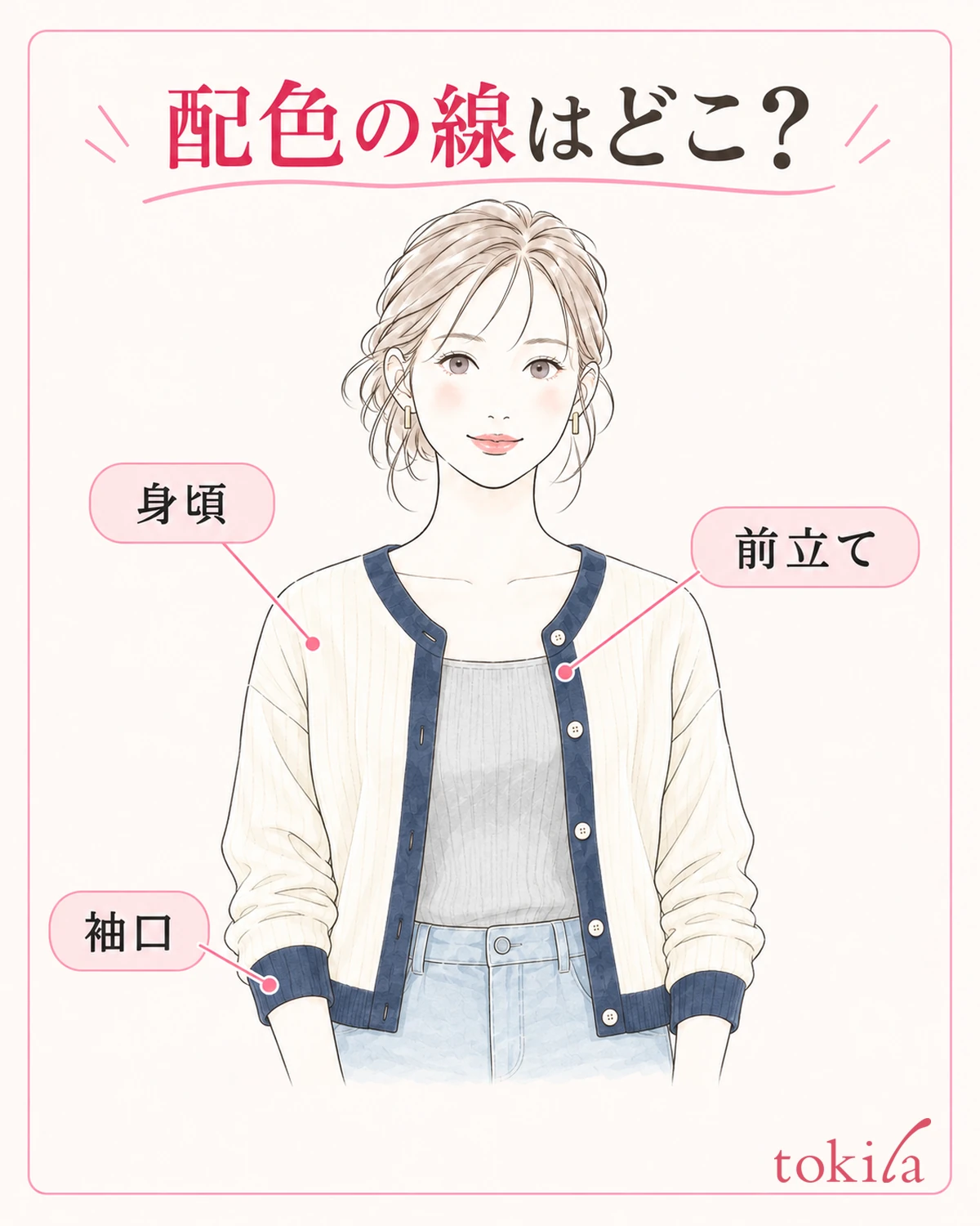
First, spread the cardigan out naturally and distinguish its broad main body from the strip-shaped bands along the front opening. If the collar or cuffs have another color too, follow where the same contrast colors repeat. Even if the product name says two-tone, the buttons and sheen of the yarn may not appear to share exactly those two colors.
Next, put it on and arrange it as you intend to wear it today. Leave it open if that is your plan; if you will button it, check it fastened only as far as is comfortable. A front band's width when laid flat may differ from its visible width from the front when it follows your body. Avoid judging only with your sleeves held behind you.
In the mirror, pick one area that first catches your eye: the two lines at the chest, the neckline, or the wrists. When the cardigan is open, the top underneath adds a color between the two front bands. Start by seeing what sits next to what inside and outside the lines, before counting the outfit's colors.
The direction and thickness of the knit can create shadows even where there is no contrast trim. Move the garment slightly to check rather than deciding a shadow is a third color. Conversely, if a color on the reverse folds outward into view, count that surface among the colors visible when worn. There is no need to stretch the edges to equalize the widths of the colors.
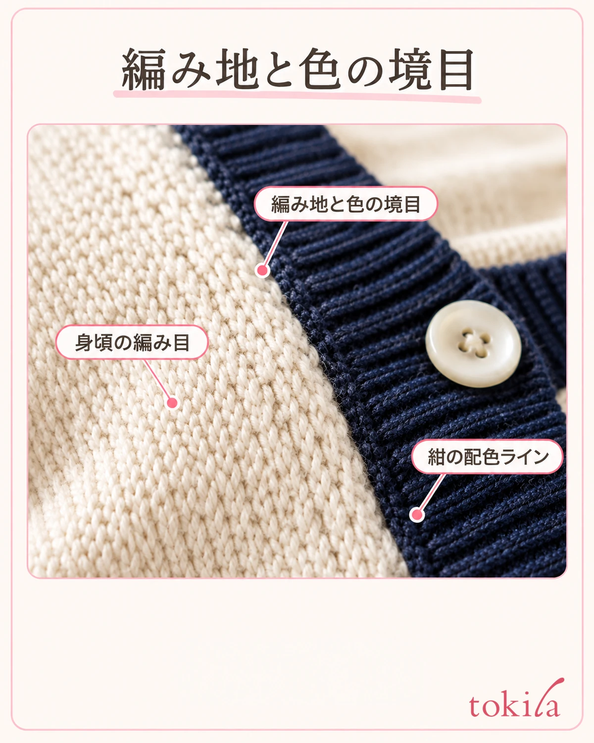
At this stage, do not fold the cuffs or tuck the collar inward just to hide a color that bothers you. Check which lines show with the garment in its natural shape. If the buttons on the two sides are misaligned, before choosing colors, check how cardigan buttons line up.
If the lines do not bother you when you view the whole outfit, keep that color scheme and continue. There is no rule that you must always pick up one color from a two-tone garment. Simply identifying whether the area you are unsure about is the front band or the cuffs makes it easier to choose which garment to change next.
2. Choose whether your top connects with the body or the contrast trim
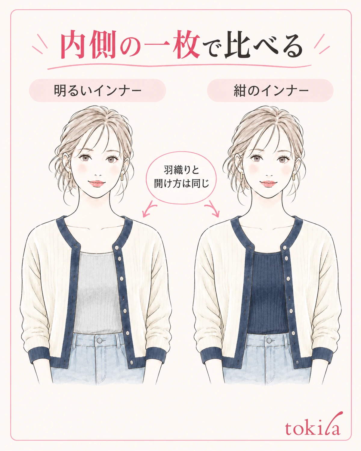
For now, choose one plain top you already own. Avoiding patterns or large logos is not an absolute rule; it simply makes the relationship between colors easier to see in the first comparison. Keep the cardigan and bottoms the same and change only the top underneath.
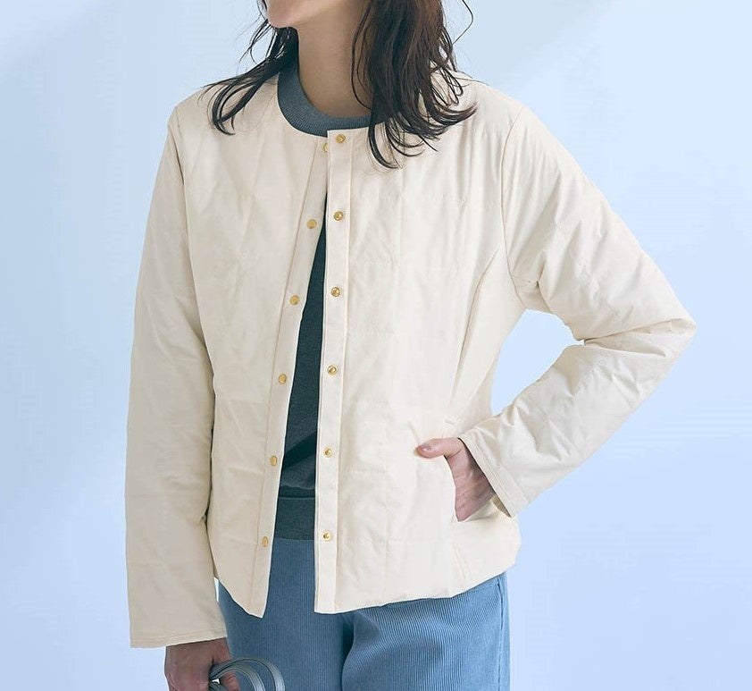
For example, with a natural-colored body and navy front bands, you can compare a light top with a dark navy one. With the lighter option, the body and central area become closer in tone, leaving navy lines between them. With a top close to navy, the front bands and center may seem to connect. Choose whichever you prefer.
Even if you do not have an exact color match, start by placing a garment of similar lightness beside it. Two colors called beige can differ in yellow or red undertones, so look at the actual garments together rather than assuming their names mean they match. There is no need to choose an uncomfortable top solely to match colors.
When comparing, keep your distance from the mirror and the way the cardigan opens as similar as possible. Buttoning one look and opening the other widely changes both color and area. Compare the two tops with the same way of wearing the cardigan first, then adjust how you wear it after choosing the color to clarify what you liked.
If you have only one candidate, you do not need to force yourself to add another garment. One option is to enjoy how clearly the front bands show in the current combination. Making a colored line less noticeable and creating a pleasing color scheme are not the same thing. You can choose to keep a line you like.
Do not assume white or black always works; compare the tones of your own garments and where they show. If you want to organize the colors of the whole outfit, the basics of color coordination can also help. Here, first focus on the single area that forms inside the front bands.
3. Compare the central color area with the cardigan open and buttoned
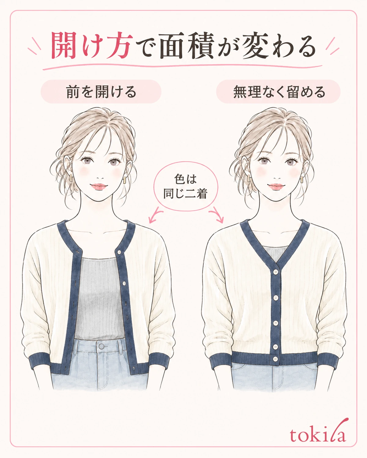
Once you have chosen a top, check how to open the front. Even with the same cardigan color, opening it spreads another color through the center, while buttoning it creates a broad area of the body color. Choosing the visible proportions without changing the colors themselves is one of the pleasures of a layering piece.
First, view yourself from the front with both arms relaxed at your sides. If you wear it open, check whether the top visible between the bands extends from chest to hem or shows only a little at the neckline. Do not treat a pose with the hem continuously held apart as its usual appearance; return to a hands-free position.
If you also want to compare it buttoned, use the garment's matching buttons and holes only as far as you can fasten them comfortably. There is no universal number of buttons to do up from the top. Changing the fastening position also changes the neckline opening and the visible shape of the top. Check how the neckline sits as well as the colors.
If the lines seem too strong, before changing the top, check whether the two front bands are separated or closer together in the center with the current opening. This comparison is to examine differences in line position and area. It does not promise effects such as looking slimmer or concealing your body shape.
If you expect to sit in a chair, sit down once, then stand and let the front fabric settle naturally. Do not fasten it so tightly that it feels uncomfortable for the sake of color coordination, or keep holding down bands that open widely whenever you move. If the way of wearing it is impractical, return to wearing it open or choosing another garment.
If you will layer a jacket over it outside, also check the neckline and hem colors visible beyond the jacket. Rather than lining up the trim for a moment in the mirror, decide whether you like the proportions that show during ordinary movement. Once you have settled on the opening, move your attention to the cuffs and bottoms.
4. Check the boundary between cuffs and bottoms with your arms down
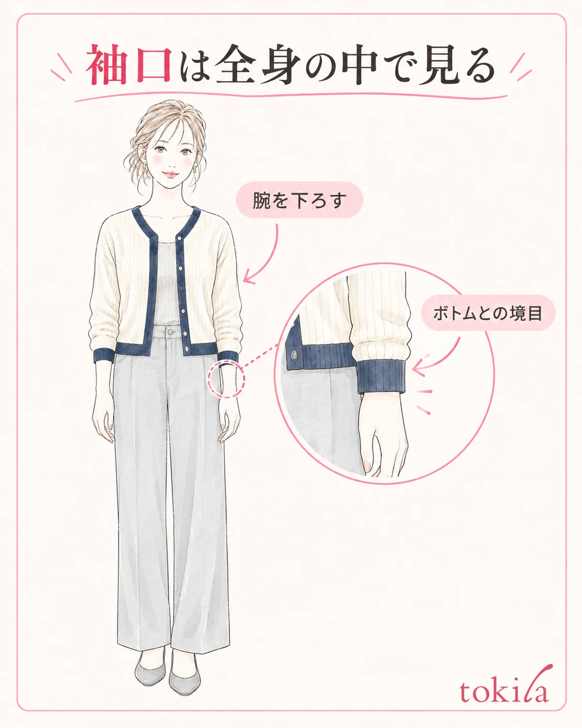
The garment next to the cuff color changes when you stretch your arms forward or lower them. With your arms down, the cuffs may overlap the sides of your bottoms or sit near a hem. Do not decide solely from colors matched to the front bands; check how the wrist area looks within the whole outfit.
First, return the sleeves to their natural length. If the top's sleeves extend beyond them, compare that color too, to the extent it is visible. You do not have to hide it, but if it extends much farther on one arm, distinguish intentional layering from a shift that happened while dressing to make the color easier to judge.
If the garment can be worn with turned-back cuffs, first check the reverse color before trying it. Folding back the face of the trim does not necessarily add more of the same color. The reverse's ground color or seams may appear. If the added thickness makes your wrist feel tight, stop folding it for the sake of adding color and return it to its original position.
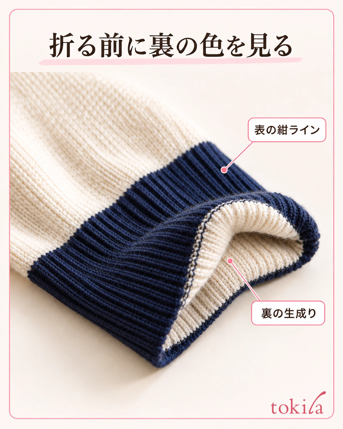
If the boundary between cuffs and bottoms bothers you, first change just one pair of bottoms you already own and compare. You can bring the lightness closer to navy cuffs or keep the line visible against light bottoms. You do not need to make every line in the outfit inconspicuous; choose an accent you like.
When holding a bag, also see whether its handle overlaps the cuff. However, you do not need to hold the bag in exactly the same position all the time for that reason. Include your usual way of carrying it when deciding whether you like overlapping colors. If a close-up of your wrists leaves you unsure, return to a head-to-toe view.
Distinguish shadows from folded fabric and reflections from metal buttons from the contrast trim as well. Slightly change your arm's angle in the same room, and avoid treating one bright reflection as the color of the entire garment. Enjoy its natural texture rather than dirtying or wetting it to change its sheen for a comparison.
5. Return to the full outfit and record the colors and styling you want to keep together
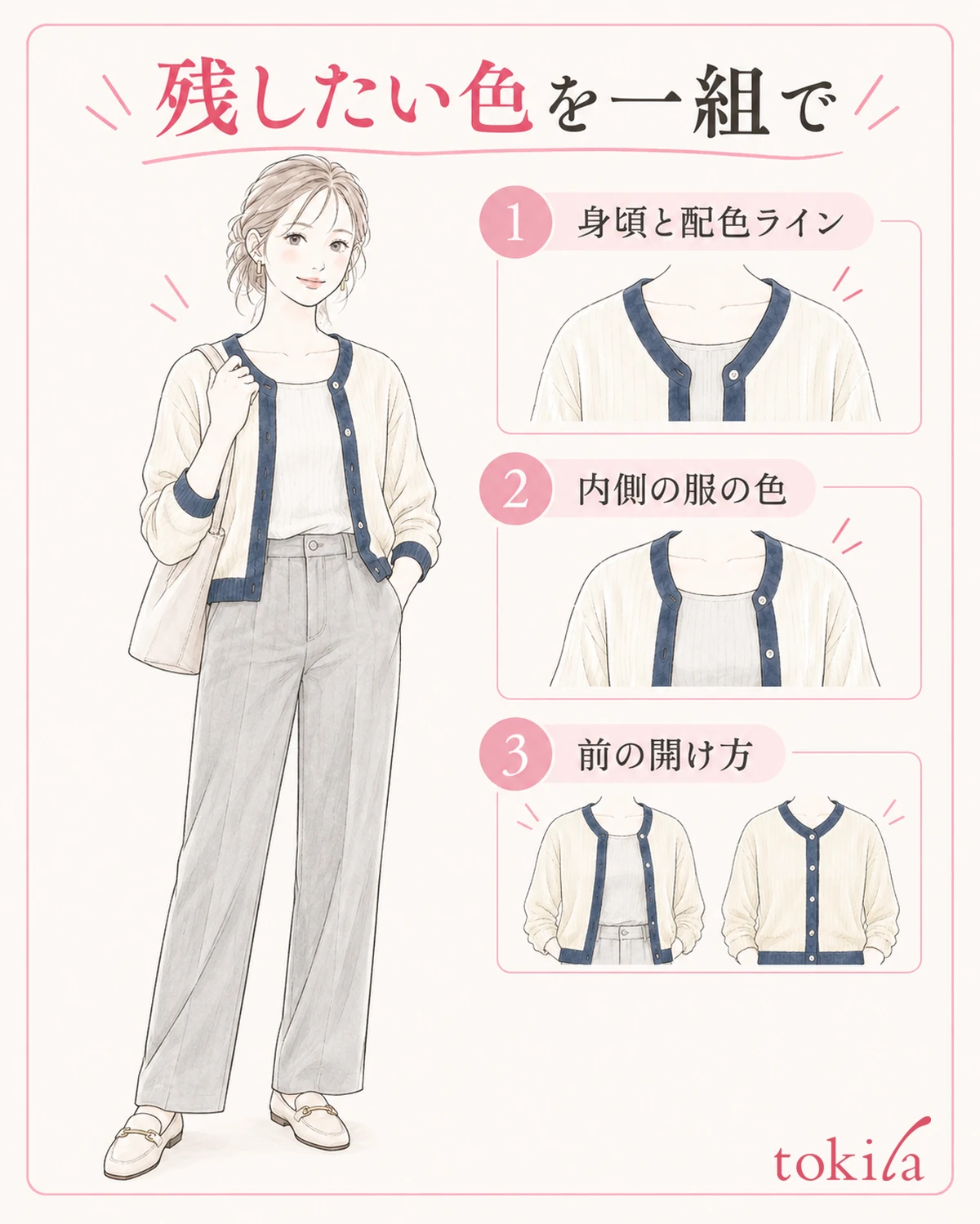
Finally, put on the bottoms, shoes, and bag you plan to use. If you wanted the front bands to connect with the top, check whether you also like that relationship in the whole outfit. If you wanted to preserve the cuff color, confirm that the line is visible with your arms down too.
Rather than continuing to move close to the mirror to hunt for details, pause once at a distance that includes your whole body. Do not make matching the front bands, cuffs, and shoes in one color a condition of finishing. Even an outfit with many colors can be your choice if you know what you want to show and like the combination.
If you are still unsure, return to the area you first chose as a concern. Change just one thing: the top or the opening if the central area seems too broad, or the bottoms if the cuffs and feet seem unsettled together. Avoid changing everything at once and then concluding that a color does not suit you.
If you take photos, use the same place and framing and view the two comparison images together. Screens and lighting can make colors look different, so do not use the photos as proof of precise color matching. Use them to help remember a combination you liked in person.
For a note, record the colors and styling together, such as "natural-colored body, navy trim, light top, front open." The visible areas can change with the season and layers the next time you wear the same cardigan. Treat the note as a starting point for choosing again rather than fixing the previous choice as the right answer.
Contrast trim can be challenging to coordinate, while also giving your existing clothes a different expression. Look at the broad body, narrow front bands, and cuffs with your arms down in order, then return to the full outfit. Follow this sequence to find a comfortable combination, whether you want the lines to stand out or blend in that day.