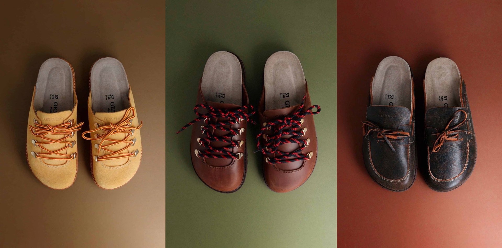
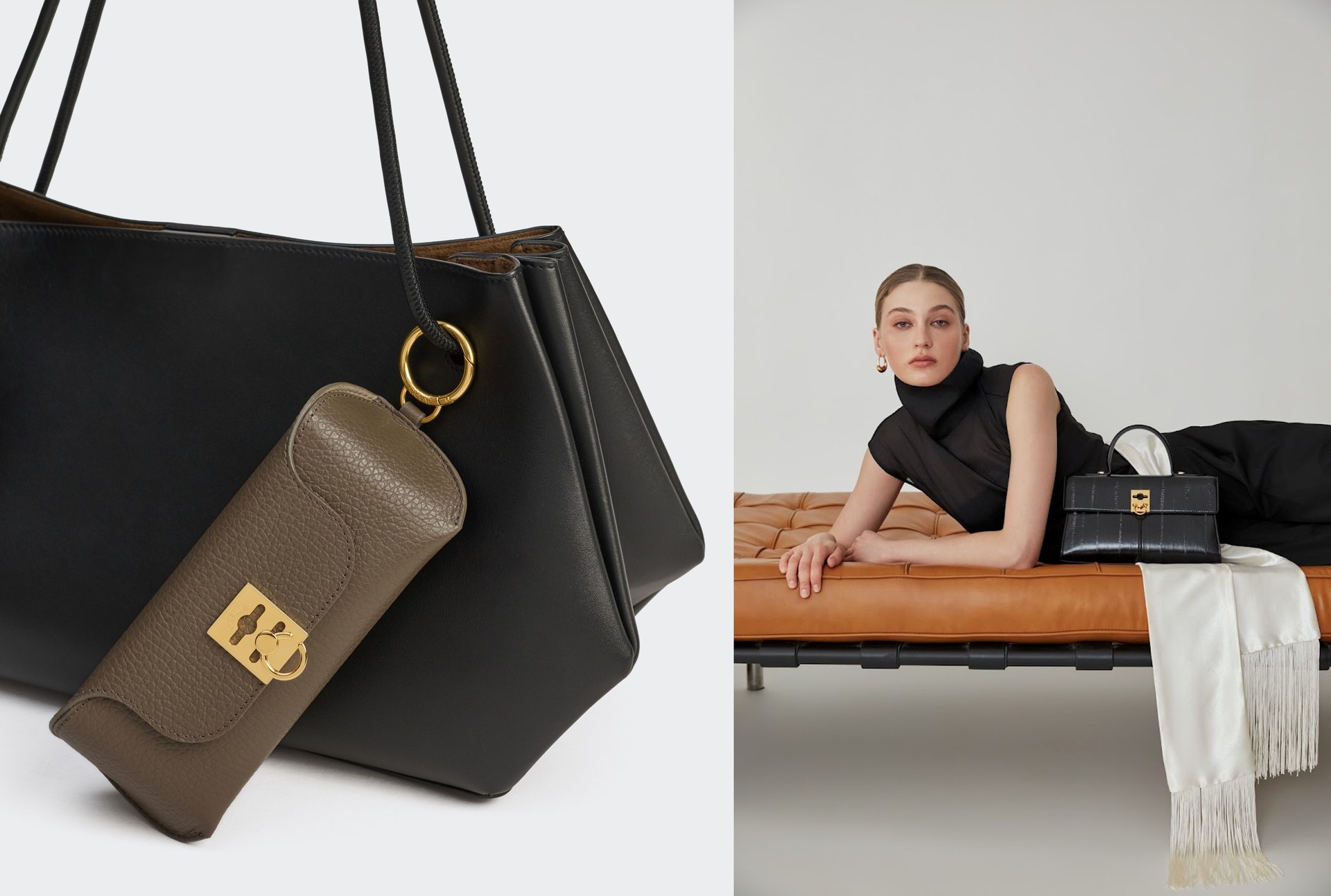
When you pair a bag with a patterned skirt, the outfit can feel like it has more colors than the clothes alone. You were sure black would be a safe choice, yet it looks a little heavy. In that case, try picking one color used in the pattern and adding just one accessory close to that color. Creating a color shared by the pattern and the accessory makes it easier to see what you are changing as you compare.
This article introduces an order for narrowing down options, focusing on a patterned piece you already own and a plain bag. It is not a diagnosis saying that matching colors will always suit you; it is one way to look for combinations you like. You can also choose not to pick a color from the pattern and enjoy a different color instead. Start with just two items, the clothes and the bag.
1. Look at the pattern's base color and the motif colors separately
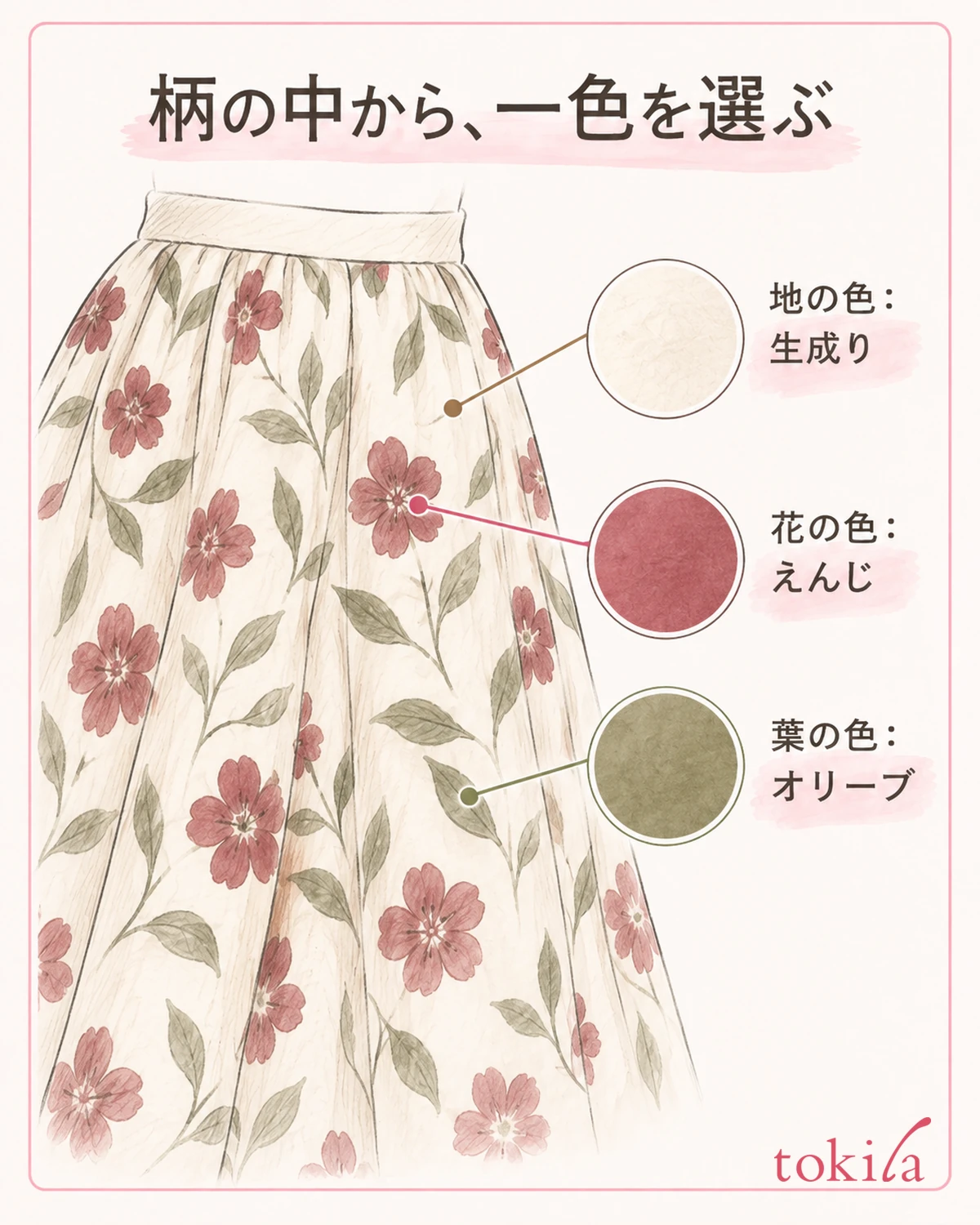
First, decide on one patterned piece of clothing you want to match. For a check, look at the lines and the areas between them; for a floral print, look at the flowers and leaves and the ground around them, and see which colors are included. You do not need to count every tiny color. Choose two or three candidates from the colors that are easy to spot even from a little distance.
The base color is the color that appears to spread around the motifs. For example, if a skirt has an ecru ground with burgundy flowers and olive-green leaves, ecru, burgundy and olive are the candidates. For a pattern where the ground and motifs are not clearly separate, it is enough to divide the colors into those that cover a large visible area and those that appear in small amounts.
Thin lines you could see when holding the clothes in your hands may not stand out in a full-length mirror. If you use that color on the bag, the bag itself may stand out before any connection with the pattern does. After examining the pattern up close, step back once to the distance at which you normally face people, and check the colors that still remain visible.
You do not have to get the color names exactly right here. Words such as "reddish flowers" or "dark green leaves" are enough to tell them apart. Rather than matching your clothes to a printed color swatch or a color on a screen, look for colors within the actual clothes. Impressions can change under different light, so compare the clothes and the accessory in the same place.
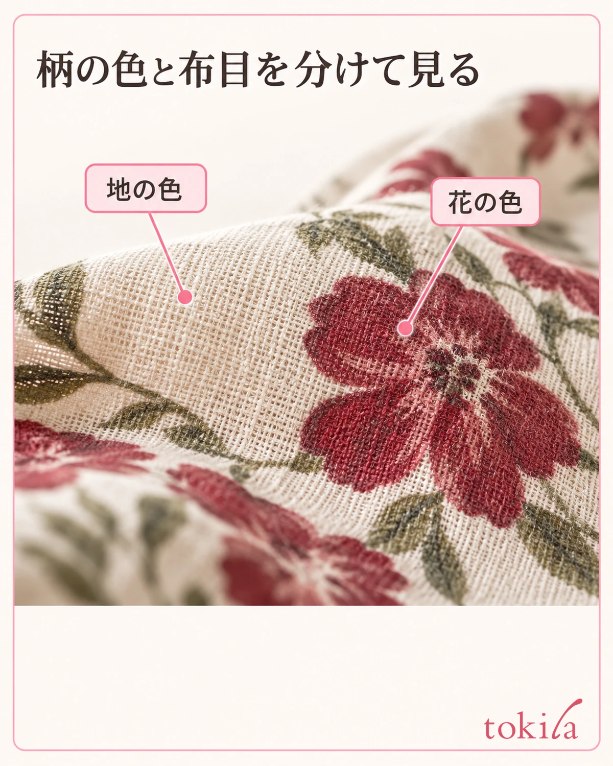
If the pattern has many colors and you cannot narrow them down, consider only the areas that show at the front when you wear it. Do not pick up colors from the inside seam allowance or the back of the hem; look for the colors you want to show with the way you wear it now. There is no need to compare the color of the reverse side of the fabric as if it were the same as the color scheme on the front.
First spread out the patterned area and imagine the parts that will be hidden by a jacket or a belt. You may choose a color that will hardly show once worn, but if you want to connect with the pattern that is visible, it is easier to check when you choose from the parts that remain visible when worn.
2. Choose one color depending on whether you want a calm look or to make the motif stand out
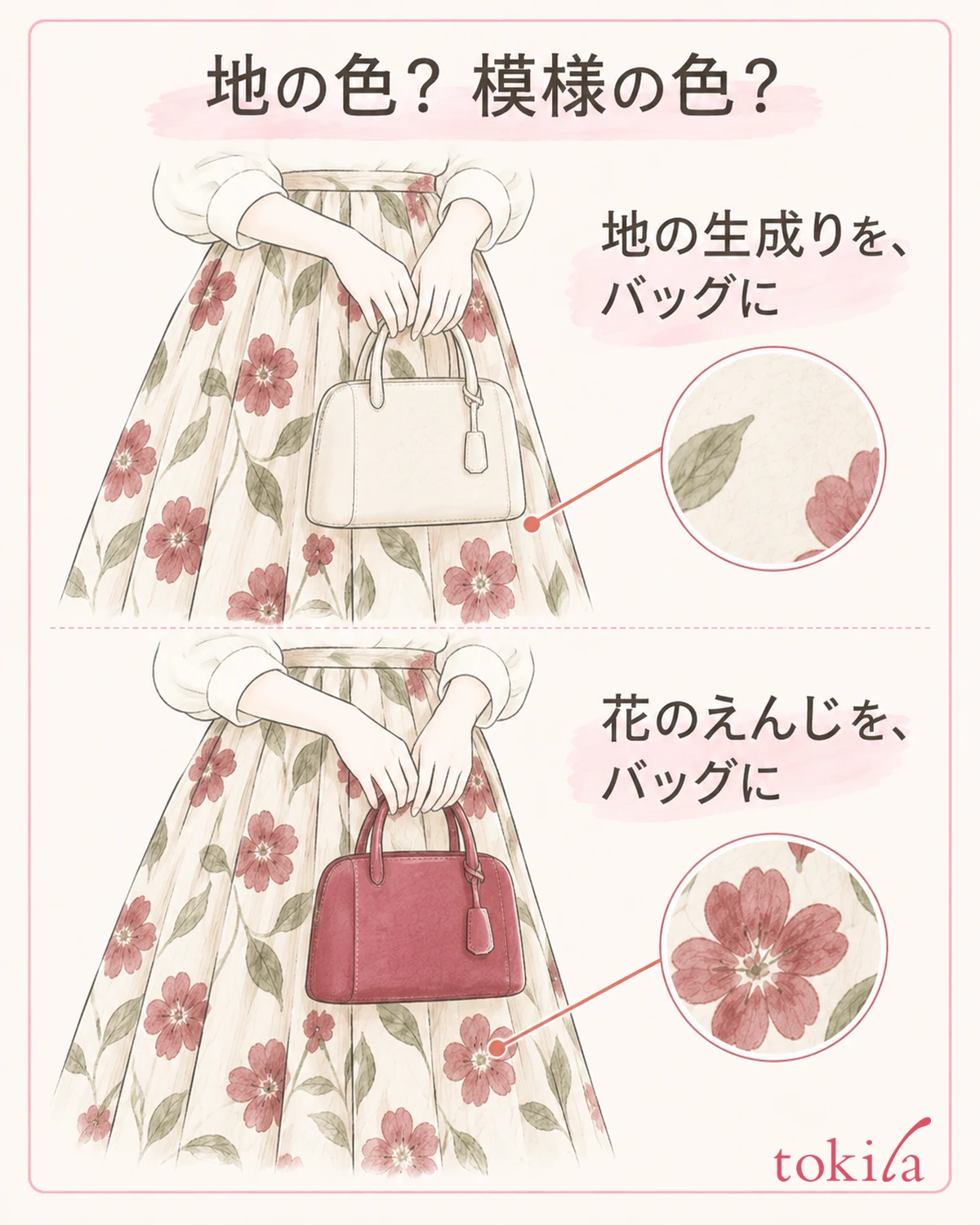
Once you have your candidates, decide on one impression you want to give today. If you want to keep the presence of the pattern while pulling the look together quietly, first try a bag close to the base color. If you want to enjoy repeating the color of the flowers or lines, choose one color you like from the motif. This is an order to try things in, not a guarantee that the base color will always look calm.
In the example of ecru ground, burgundy flowers and olive leaves, you can compare options such as an ecru bag that connects the light areas, or a burgundy bag that repeats the color of the flowers. Rather than gathering accessories in all three colors from the start, narrowing it down to one color, such as using the color of the flowers today, makes the differences easier to follow.
The criterion is not only the largest color in the pattern. If you repeat a color that appears in small amounts on the bag, you can place that color elsewhere in your outfit too. However, a small dot and a whole bag cover very different visible areas. Keep in mind that a vivid color that was subtle in the pattern can feel strong once it becomes a bag.
If a color you like is among the candidates, you can start from there. There is no need to rule out colors in advance based only on your age or skin-tone category. Think about the actual occasion and your own taste together, such as wanting to look understated for work or to enjoy color on your days off.
If you do not own a bag in a close color, temporarily match it with a plain one close to the lightness of the base color. The point is not to buy something extra just to match one color of the pattern exactly, but to work out whether what feels off is the hue or the lightness.
If you are undecided, keep one candidate close to the base color and one close to the motif color. Do not decide which is right in your head alone; hold the actual items up in the next step and then choose. The color you did not pick can remain a candidate for another day.
3. Hold up a bag in a close color and adjust the lightness and vividness
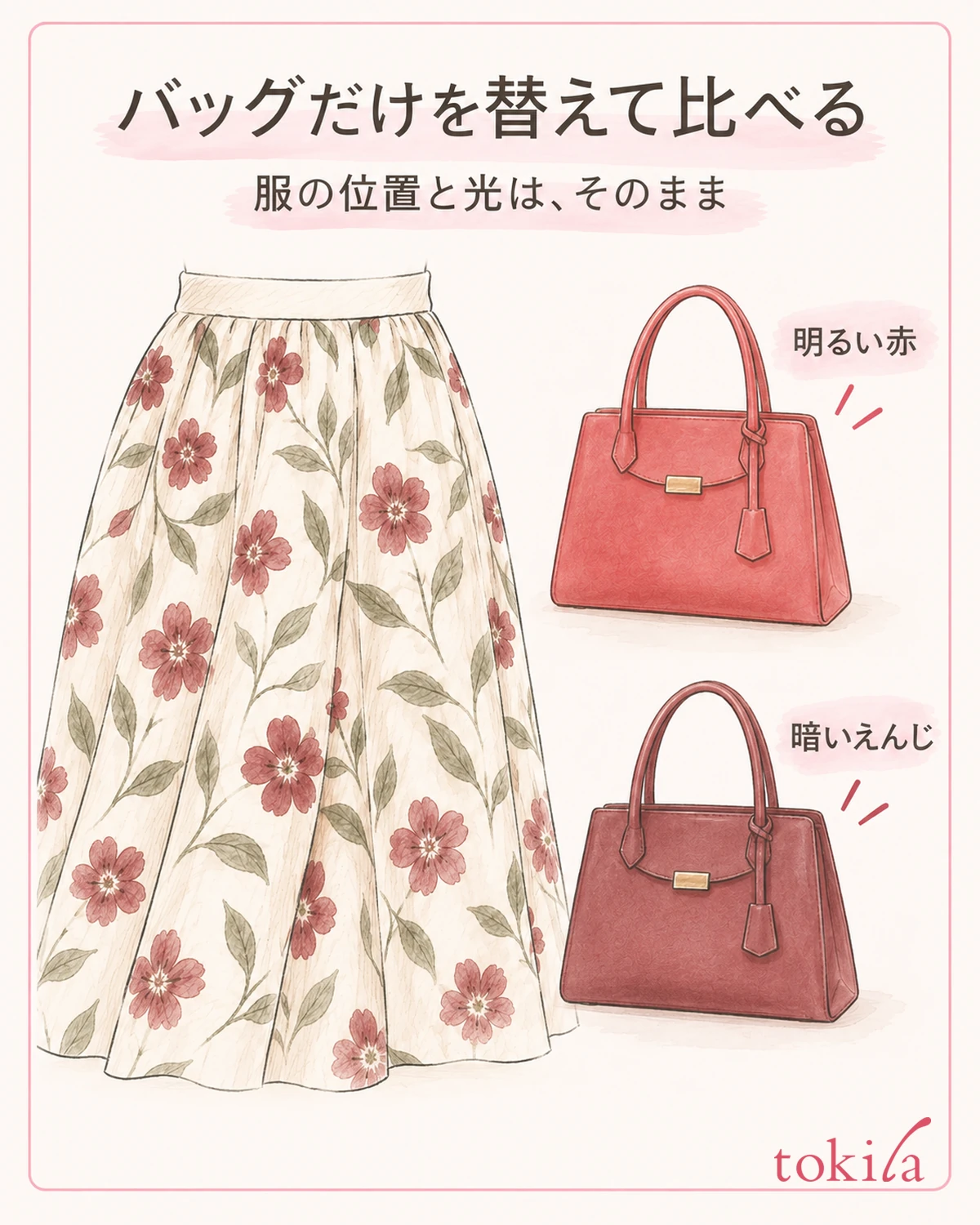
Place a bag close to the one color you chose next to the clothes. You do not need to look for a perfectly identical color to buy. First, look through what you already own for something with a similar hue, such as reddish, greenish or a light ecru tone. Even the same color name can look different, so judge by the actual items side by side rather than by the name.
Next, check whether the bag looks lighter or darker than the color in the pattern. If you hold a bright red bag against burgundy flowers, the bag may catch the eye more even though both are reddish. If only the bag seems to float, compare it with a slightly darker red option, if you have one.
If it still looks strong after changing the lightness, turn your attention to vividness as well. A clear green and a grayish olive connect to the leaves in the pattern in different ways. Rather than deciding with words like dark or light alone, look separately at the difference in lightness and the difference in color intensity, and it becomes easier to choose the next bag to try.
When comparing, keep the position of the clothes and the lighting unchanged, and swap the bags in one at a time. If you place two bags overlapping, the overlapping shadows and other colors come into view, and the combination you want to judge becomes hard to see. After holding it close at hand, it is also important to move away and look at it in the position where you would actually carry it.
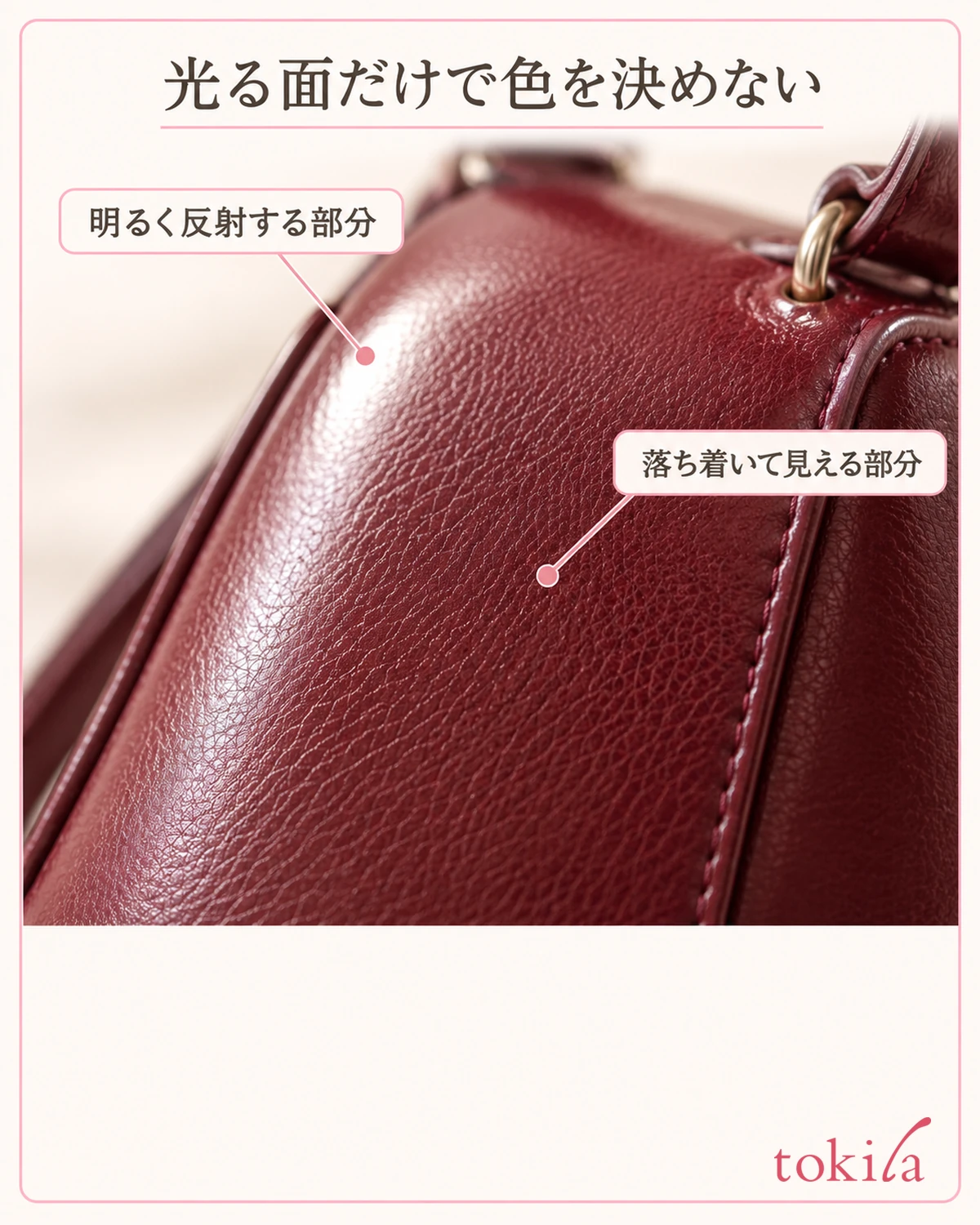
The gloss of the material also changes the impression. Do not decide on a color by holding only one shiny part of the bag against the pattern; check it from the front and from a slight angle. If you keep photos, do not treat automatic correction or screen settings as a substitute for the real item. Subtle differences between similar colors are also covered in the steps for comparing clothes of the same color.
4. Before adding shoes or accessories, check the area and position of the color
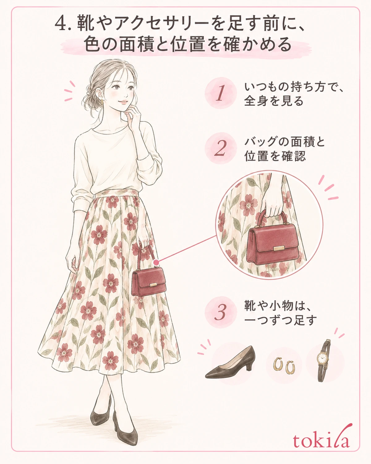
If you change the length of a crossbody strap, adjust it only within the range you normally use. The visible part of the pattern and the place where the bag overlaps change, so even a bag of the same color gives a different impression. Fixing how you carry it while choosing the color, and adjusting the position after you decide, keeps you from mixing up the two differences.
Once the bag is decided, look in a full-length mirror, including any plain clothing you wear with the patterned piece. The area and distance of color differ between accessories laid out on a desk and accessories worn. Check with the way you usually carry it, such as under the arm, in the hand or on the shoulder.
If you chose a bag close to the color of the flowers, check where the eye goes in a position where both the flowers and the bag are visible. Even if only the bag looks strong, you can enjoy it as is on a day when you want the accessory to stand out against the pattern. If it bothers you on a day when you want the pattern to be the star, tone down the color of the bag, or try an option with a smaller visible area if you have one.
You do not need to match shoes, belt and earrings to the chosen color. If you like it at the bag stage, the shoes can be another candidate, such as the color of a plain piece you are already wearing. If you add only the shoes first and then one accessory, you can check which addition changed the impression.
In a combination with several patterns, the size and direction of the motifs change in addition to the color. While you try out this color selection, keeping the accessories plain reduces the conditions you are comparing. If you like patterned bags, think through the color candidates with a plain one first, then bring it back and reconsider whether you like the whole look, motifs included.
You do not have to give up a bag you like just to fit a set ratio. Use the basics of color combinations as a clue, but give priority to the area actually visible, ease of use, and whether it suits where you are going.
5. If it does not come together, take one accessory back and compare again
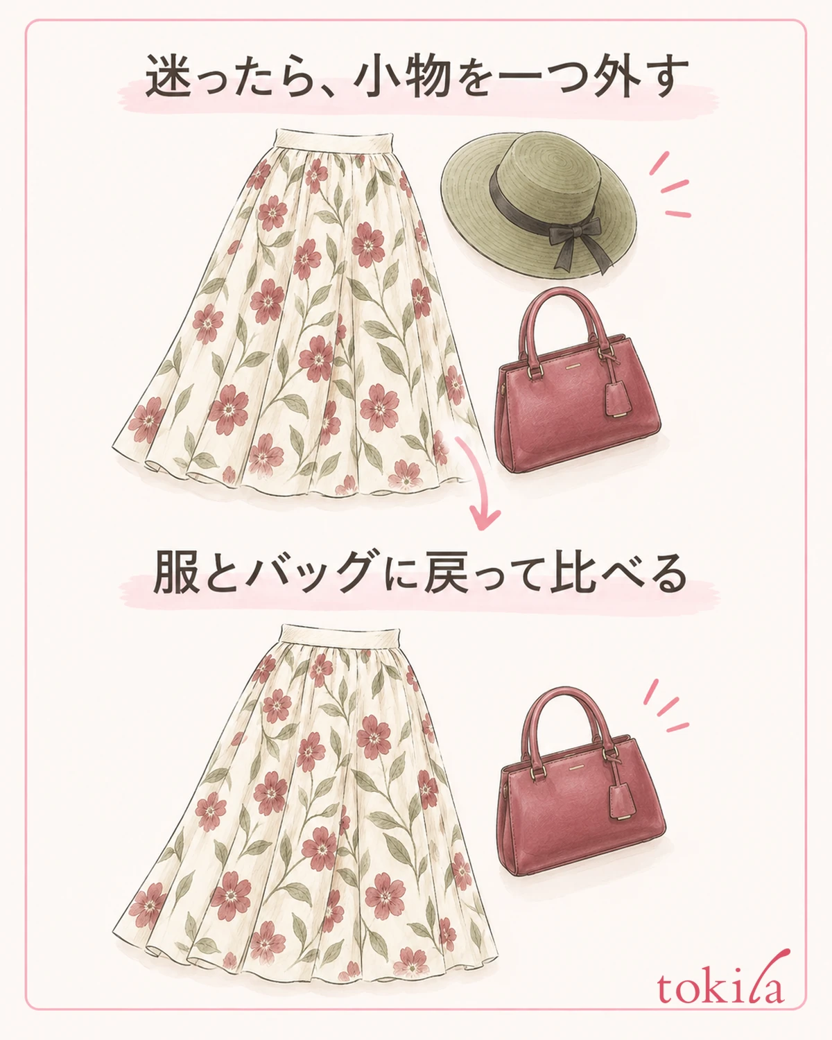
If the colors feel scattered once you have finished, take off the last item you added before adding any new accessory. Go back to the combination of the patterned clothes and the chosen bag, and check whether you liked it at that point. If you change all of your clothes at once, you will not know which change was necessary.
If only the bag looks detached, check again which color of the pattern you chose. If you chose the color of a thin line that can only be seen up close, one idea is to switch to the color of the base or motif that is visible even from a little distance. If you want to keep the contrast, you can also choose to make that bag the star deliberately.
Conversely, if the whole look feels hazy, do not add more colors right away; try bags of different lightness within the same color family. Switching from a bag close to the base color to one close to the motif color is another option. Returning to the purpose you set at the start, such as "I want a calm look" or "I want to enjoy the color of the flowers," makes the direction of change clear.
When you review the look in the light of the place you are going out to, move the clothes and the bag together. Avoid comparing a color you liked indoors with only your memory of the bag seen by a window. Even if the impression changes with the place, that alone does not tell you anything about the quality of the clothes or how well they were dyed.
Finally, also check how easy the bag is to carry. Check that it holds what you need and that it does not hide the pattern too much when you walk, so that you do not choose an accessory that is hard to use just because the colors match. Once you are happy with it, jot down the part you chose together with the accessory, for example "a bag close to the burgundy of the flowers" or "a green slightly darker than the leaves." Next time, you can try the same pattern starting from a different color.