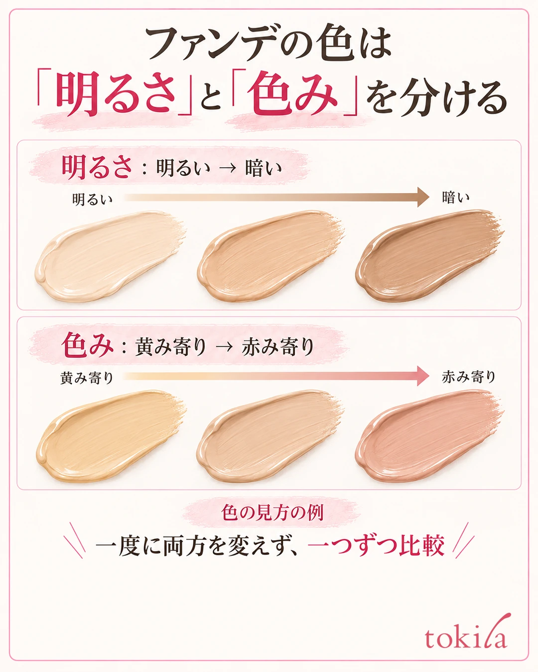
Choose a foundation color by thinking of brightness and yellow or pink undertones separately, and by how well your face connects to your neck. If you decide only from the color in the container or the back of your hand, it may look too light on your face or the undertone may stand out.
This article covers the order for narrowing down candidates, where to test in a store, and what to check when buying online. For product types and how to apply, see the basics of foundation. Start in this order: "separate brightness and undertone, then test thinly along the jawline, then check face and neck in the same light." The colors in the diagrams are examples that show how to compare, so please check against the swatches of the product you plan to buy and on your actual skin.
1. Before looking at shade numbers, think of brightness and undertone separately
When choosing a shade, look at the difference between light and dark and the difference between yellow-leaning and pink-leaning separately. The brightness may be right while only the pinkness looks strong, or the undertone may be close but the shade too light. Rather than lumping it together as a "color that doesn't suit me," put into words what is different.

It is important not to decide the color to buy from a personal color label alone, but to build in a step of checking on your actual skin.
For example, if your concern is "looks ashy and white," first check whether the brightness is too high. If "only my face looks yellow," compare candidates of about the same brightness with different undertones. However, lighting and the color of your primer also change how it looks, so match the conditions first and then change candidates. Changing both at once makes it hard to tell what worked, so narrow down the axis you compare one at a time.
Even a "standard shade" or the same number needs rechecking if the product is different
Numbers and color names are assigned differently depending on the brand and product. Even the same "ochre" is not always the same brightness or undertone. Not only when switching to another brand, but also when moving to a different line from the same brand, do not simply choose the previous number.
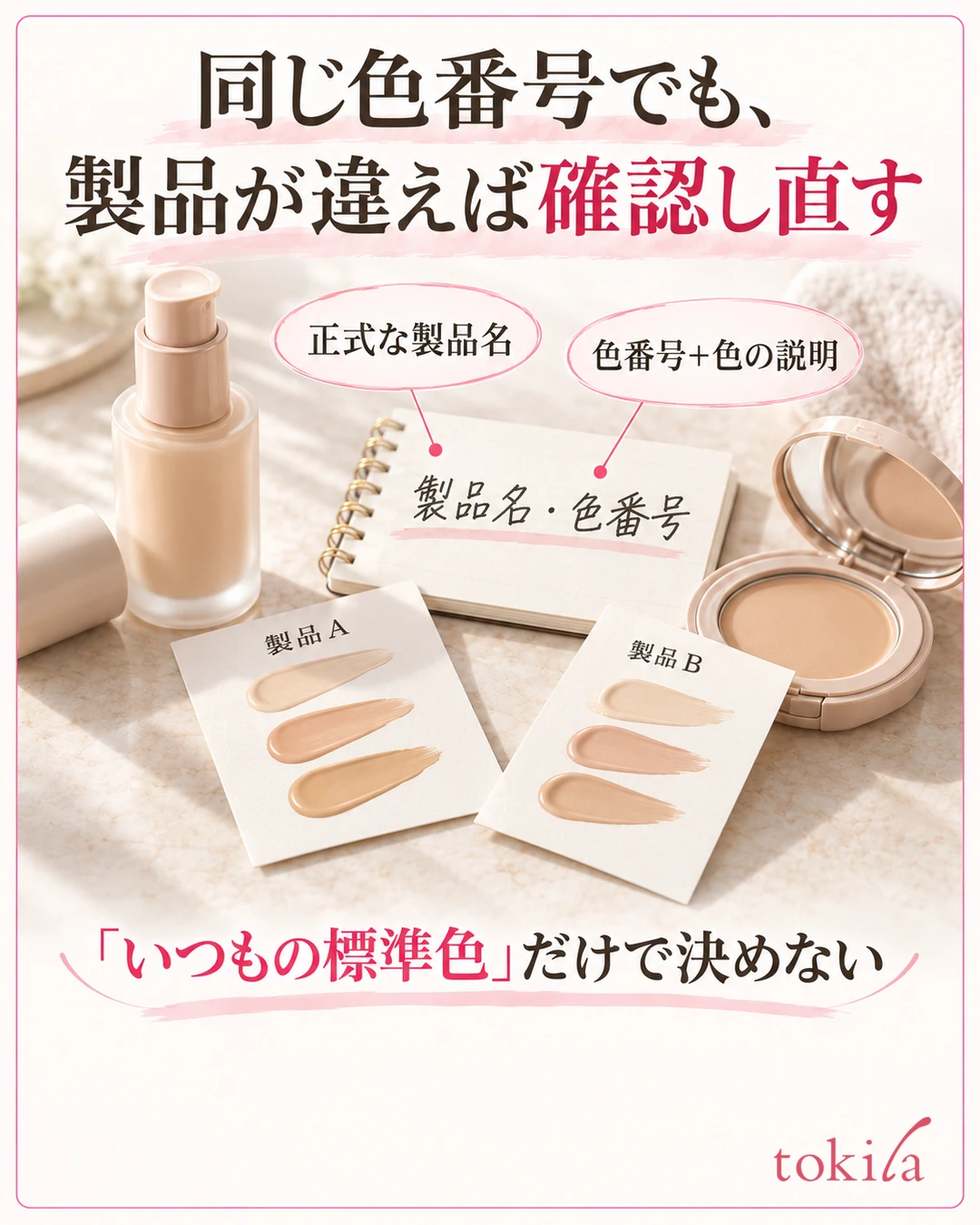
In this way, reading the description of "what the color represents," not just the number, makes it easier to compare candidates.
If you keep a record of the product you use, note the brand name, the official product name and the shade number together. Also noting whether it is liquid or powder makes it easier to consult staff in a store. Rather than just "I always use the standard shade," telling them how your current shade looks helps narrow down the next candidates.
2. Test a small amount of the candidate color at the boundary of your face and neck
Test candidates thinly along the jawline, where the boundary between face and neck is clear. You can check the texture on the back of your hand, but hand and face color are not always the same, so check separately whether it blends with your complexion. In a store, ask the staff where and how you can test.
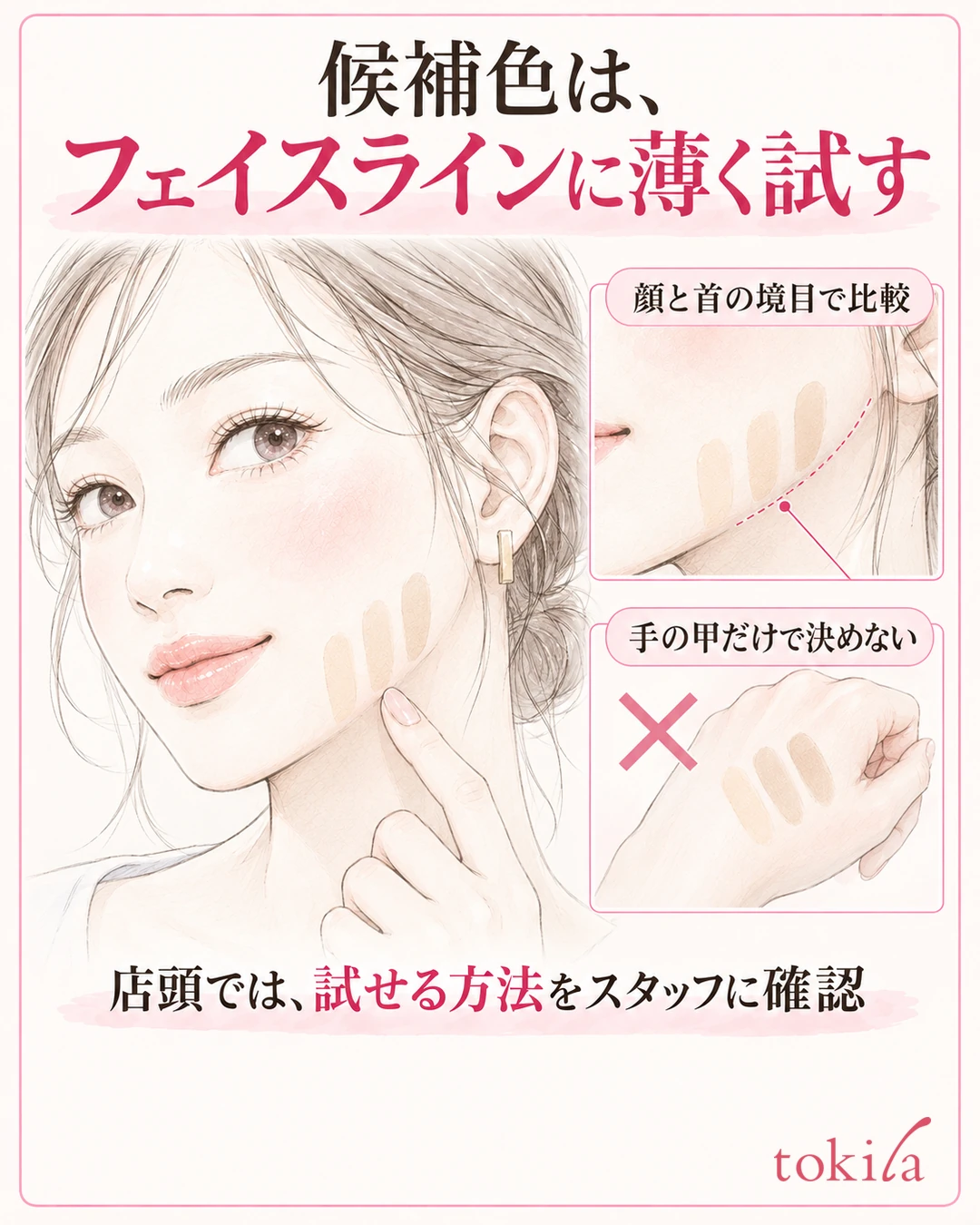

Rather than making only the center of your face look bright, look at whether an unnatural band of color forms at the boundary. Do not choose the color for your whole face based only on one part of your cheek that has redness.
The place you test also matters in whether the primer or base you usually use remains there. If you know whether you tested on bare skin or over a primer, you can explain the difference later. Follow the store's hygiene rules for shared testers, and do not reuse tools that touch your skin directly on your own judgment.
When comparing 2 or 3 shades, match the amount and the area
When you line up candidates, apply about the same amount thinly over similar areas. If only one shade is a thick band, you end up seeing differences in coverage and thickness as differences in color. When choosing a shade, compare at a thinness close to your usual finish.
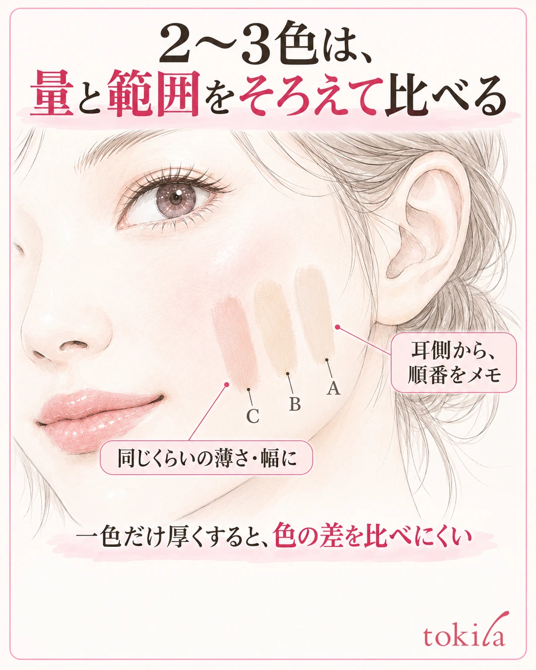
Also note the order in which you tried the colors. If you lose track of which number you applied from the left, you may mix up the candidate you liked. Left and right look different in a mirror or in photos, so leave notes that use parts of your face as markers, such as "A, B, C from the ear side." If you take photos, check the store's guidance and be considerate of others around you, and it helps to keep a short note together that matches the shade numbers to the locations.
You do not need to choose the whitest shade or the one with the most visible boundary. Compare whether one color looks like a band between your face and neck, and whether yellow or pink tones remain too strongly. Too many candidates make the differences hard to follow, so start with 2 or 3 close ones.
3. Check how it looks blended over your whole face in the same light
Once you have picked a color, look not just at the partial swatch but also at the finish blended thinly over your whole face. If possible in a store, consult the staff and check the finish on one side or the whole face. Even if you like the coverage on your cheeks, check that it does not stand out only on your forehead or jawline.

When comparing, match the light and the distance from the mirror. If only one side is lit by strong lighting, the actual difference in color becomes hard to see. Move your face slightly left and right, and tell apart where shadows fall from the boundary of the applied color.
Your usual primer, concealer and finishing powder also affect how the whole thing looks. Note what you used when testing, and if it looks different at home, review not just the shade number but also the combination and the amount used. Matching conditions makes it easier to choose again than changing everything at once.
Compare how it looks under the store mirror and the light of the places where you usually spend time
If the color and direction of the lighting differ, the same makeup can give a different impression. If possible, check the guidance on samples or trials before buying, and look at it in places where you usually spend time, such as indoors during the day. You do not need to make direct sunlight your only standard.

Check not only right after applying but also how it looks after you have spent some time. Not every product changes to the same color in the same amount of time. If it looks darker over time, think separately about whether the color changed uniformly or whether shiny or creased areas simply look darker.
Do the check from a distance where your face and neck are visible from the front. Smartphone photos help for records, but automatic correction and screen settings also change how things look. Do not make a final decision from photos alone; judge together with the impression you got in the mirror.
4. When buying online, match the official product name with the official color chart
When buying online, first confirm the official product name and shade number of the foundation you currently use. Even if the names look the same, it may be before or after a renewal, or a different type. Including the content volume and form on the purchase page, check that the product you are choosing is the right one.
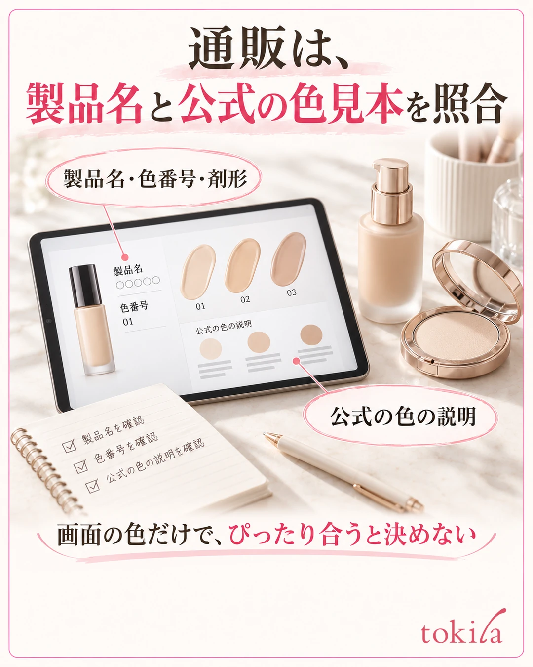
Next, read the description of brightness and undertone in the color chart for your purchase candidates. Rather than just looking at one image on a retailer's page, checking which axes the maker uses to line up its colors helps you narrow down candidates. Do not assume that the skin tone in the image matches your own face exactly.
A review saying "it was light for me" is that person's impression based on their skin, the amount they used and their primer. If you use reviews as a reference, read ones that make the shade number and the finish conditions clear, and do not treat them as a definite answer for yourself. If you are very unsure, look for ways to check before buying, such as consulting in a store or getting samples.
Keep just three notes to help you choose again
In your notes, record "the product and shade number you used," "the primer and amount you tried" and "what looked how, and where." For example, adding the location, such as "only the jawline is light" or "fits the cheeks but is pinker than the neck," makes it easier to decide the next candidate. The point is not to end with just "it failed."

Also sort out your reasons for switching. Whether only the color does not suit you, or you also want to change the texture and how it wears, determines whether you try another shade in the same line or look for a different product. When you change conditions other than color together, separate what improvement you expect from each candidate.
When a new shade works, record the conditions you checked under, not just the number. Next time you buy, you can return to the same conditions. A record of what you saw on your face and neck will be more of a clue when you think about switching than just saving a color chart on screen.
5. If it looks ashy or dark, review the amount and the boundary too
If the shade you have seems not to suit you, do not judge only from the state with a thick layer over your whole face; check on a thinly applied area as well. If it looks white only where it is thick, first review the amount and how you blend. If the difference between face and neck is still large even when applied thin and even, consider choosing the color again.
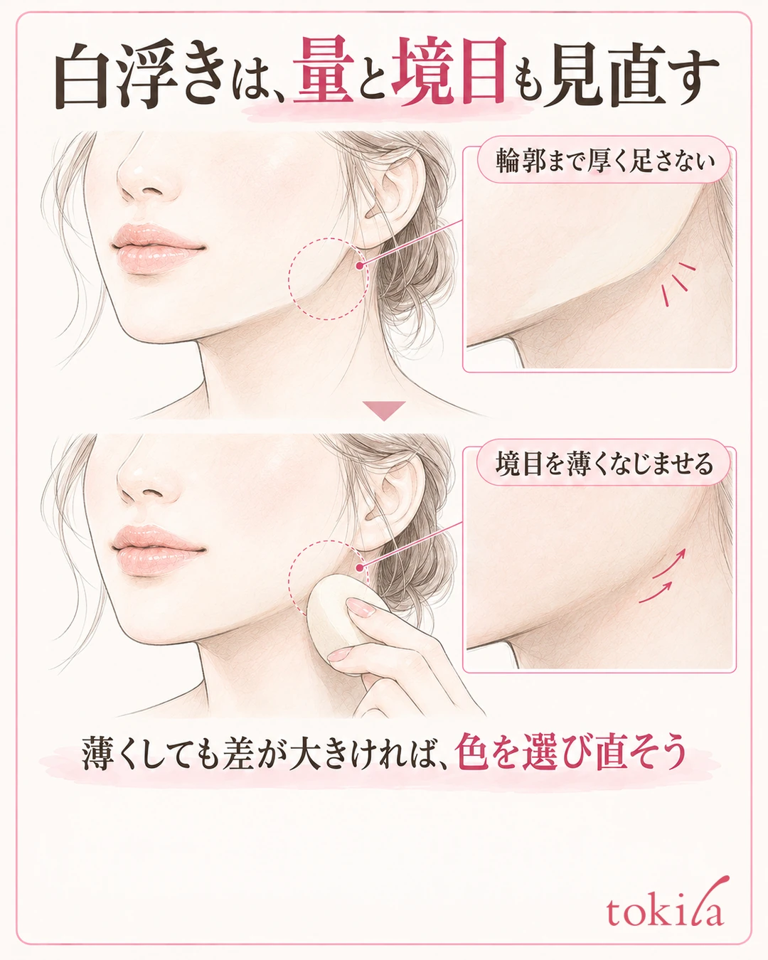
Do not keep adding the amount you placed on the center of your forehead or cheeks all the way out to the outline. Do not leave much color at the boundary, and blend it following the application method of the product you use. If the color of the primer or powder shows strongly, also check how it looks when you change that step.
Changes such as only the sides of the nose looking dark over time, or color gathering into lines, are also not something to try to solve with the color you bought alone. Tidy the parts that broke down with the order for touching up makeup, and try comparing that separately from the even finish in the morning.
If the color is very different, consult someone before mixing to adjust
Mixing a color that is too light with one that is too dark does not always give a stable finish with every product.
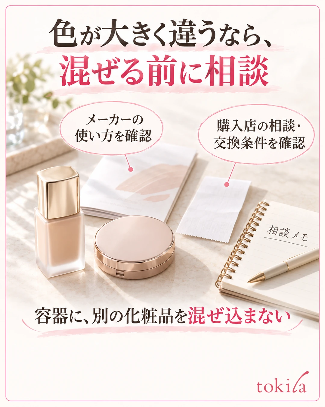
Check the purchase store's conditions to see whether exchanges or consultations are possible. Exchanges after opening are not always accepted, so it is reassuring to read the guidance before buying. If you buy a color again, tell them what was a problem with the previous color, and try candidates after deciding whether to change the brightness or the undertone.
Choosing a foundation color is not just about remembering numbers. Separate brightness and undertone, compare on your face and neck, and return to your everyday conditions to check. Using this order makes it easier to sort out both why you could choose a suitable color and why you should review it.
Written by the tokila editorial team. The editorial team organized adjustment steps you can try with the tools you already have.