A beige top and beige pants, yet when you put them together only one looks out of place. They looked close in color in the store, but different at home. When that happens, don't decide on a combination by color name alone; first lay the two pieces side by side under the same light. Separating brightness, vividness and how the surface shines makes it easier to think about what you want to change.
This article introduces a procedure for comparing two pieces of same-family clothing you already own, two at a time. "Same family" is used as a name for colors with similar undertones, and does not mean the exact same dye or numerical value. It is not a way to diagnose which colors suit you or to judge the quality of a material; it is a comparison for getting closer to the look you want today.
1. Lay the two pieces side by side in the same light, background and direction
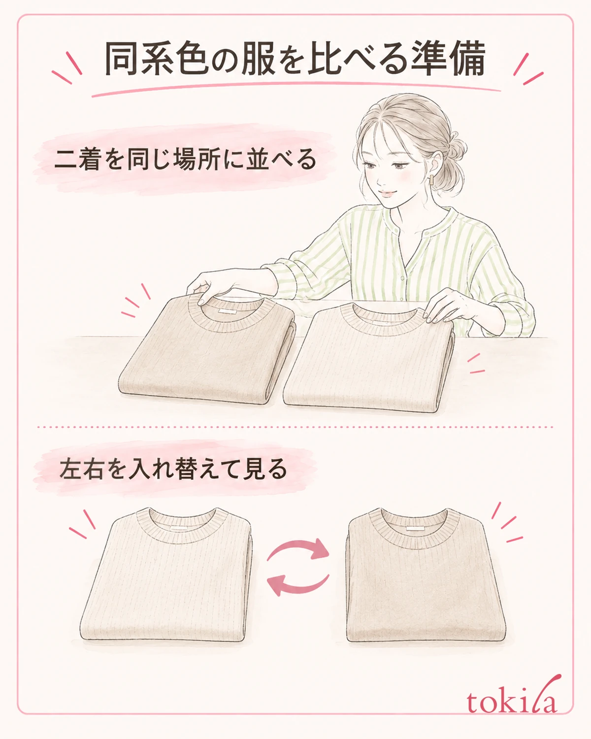
Start by taking out only the two pieces you are wondering about. Don't compare them with one by a window and the other at the back of the room; put them side by side in the same place. Avoid places where daylight and indoor lights mix, or where a strong shadow falls on only one of them. This does not mean that putting them in direct sunlight will show the true color.
Place them on a plain, calm background with the sides that show on the outside facing up. If a patterned item underneath shows through, or one is folded many times, the conditions change. Lay thin fabrics with the same amount of layering and smooth out the wrinkles lightly before comparing. You don't need to stretch the fabric or apply heat that doesn't match the care label.
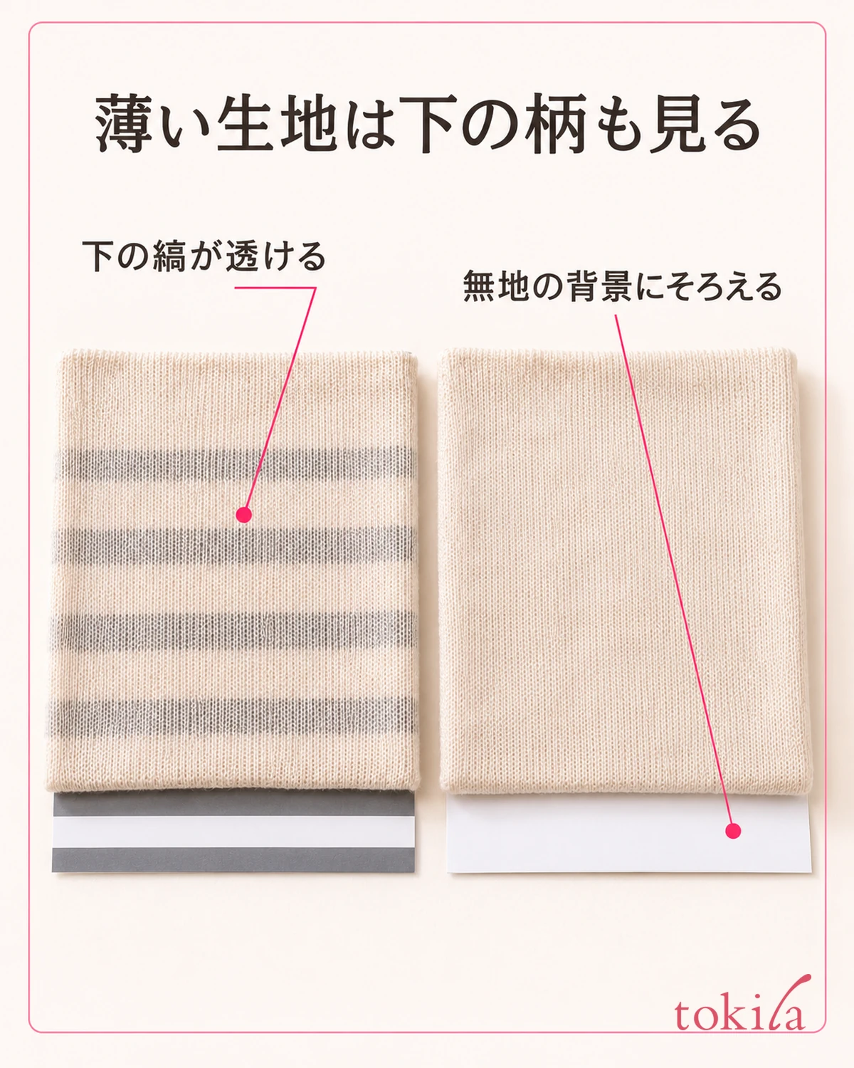
Once, swap the two pieces left and right. If the side that looks brighter changes too, review how the light falls, not just the difference between the clothes. If the same piece still looks brighter after you change positions, check that difference in the next step. This does not pin the cause on a single thing; it is a check so you don't mix extra conditions into the comparison.
Photos on a smartphone can be used to record combinations, but don't decide the difference in the real items by the color on the screen alone. Automatic correction and screen settings change the impression. Rather than collecting online-shop images with the same color name from different screens, lining up the clothes you actually own first makes it easier to connect to deciding what to wear.
If you already know where you will wear the outfit, after finishing the first comparison, check again in brightness close to that place. When you change the light, move both pieces together, and don't move just one and compare it with your memory of the earlier look.
Also match the height of the hangers when you lay them out. If one is hung higher, the light and background change, so hang them at the same height facing the front. Rather than preparing special equipment each time, deciding on a comparison spot in the same place in the same room lets you start the next clothes under the same conditions.
2. Set color names aside and look at the difference in brightness first
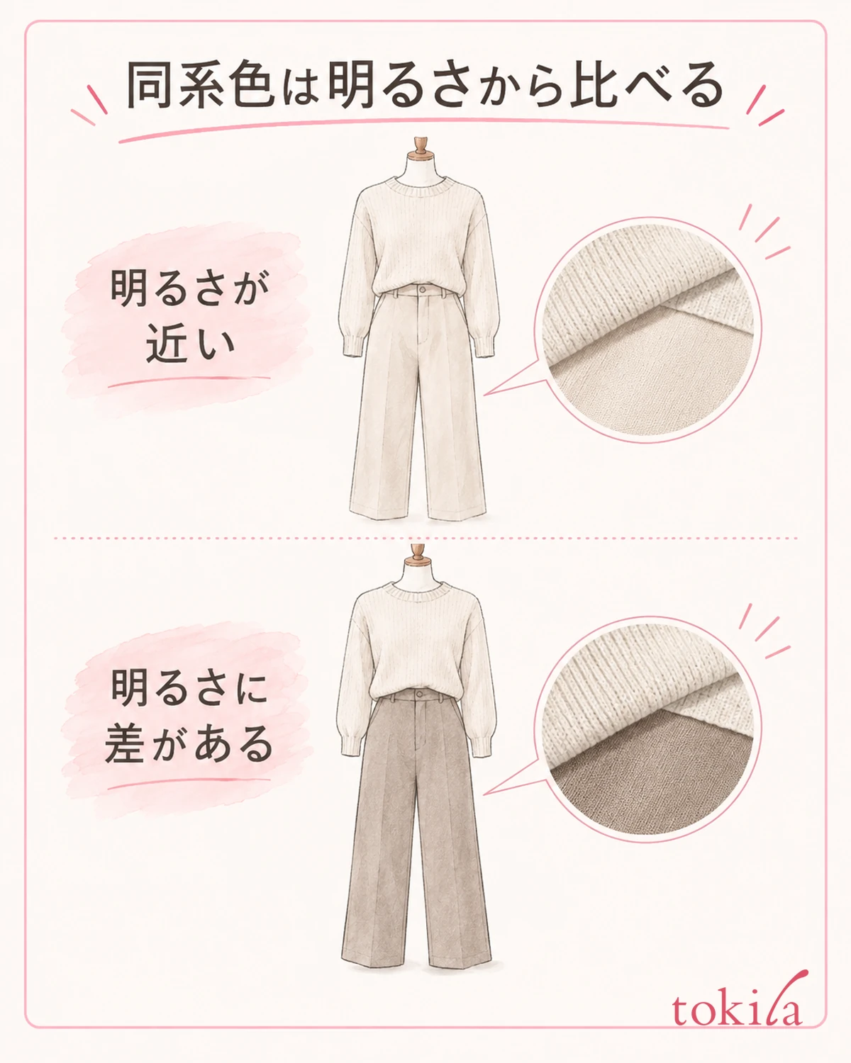
From a distance where the outlines of both pieces look about equally clear, see which one feels brighter and which darker. Brightness here is a property of color, not a ranking of good and bad colors. Even within the same blue family, a pale blue and a deep navy change how the boundary between top and bottom looks.
For example, a pale beige knit with dark beige pants can be thought of as a combination that adds a brightness difference to similar undertones. Don't aim to make the two pieces exactly the same color; decide first whether you want the boundary to show clearly or to look connected.
If the blurry boundary bothers you, keep the top fixed and swap only one of the bottoms you own. Choose either slightly darker or slightly brighter, and don't change shoes or bag yet. On a day when you want a smaller difference between top and bottom, there is the opposite approach of lining up candidates with similar brightness.
You don't have to judge them to be the same brightness from a dark-looking photo alone, or treat a black-and-white filter as the only standard. It is enough first to put the difference in the real items into words. Turn it into a short phrase that lets you choose the next piece, such as "the pants are darker" or "I want the boundary to show a little more."
If something still feels off after changing brightness, don't keep adding candidates; keep those two pieces and look at vividness. If you want to review the basic terms of color, see also the idea behind color coordination.
Whether you want the top and bottom colors closer, or to enjoy light and dark within the same family, both are valid goals. As long as it fits the goal you decided on first, the two colors being different is not a failure in itself. If you can't decide, narrow it down to two sets and wear them in turn to compare.
3. Check differences in vividness and undertone separately
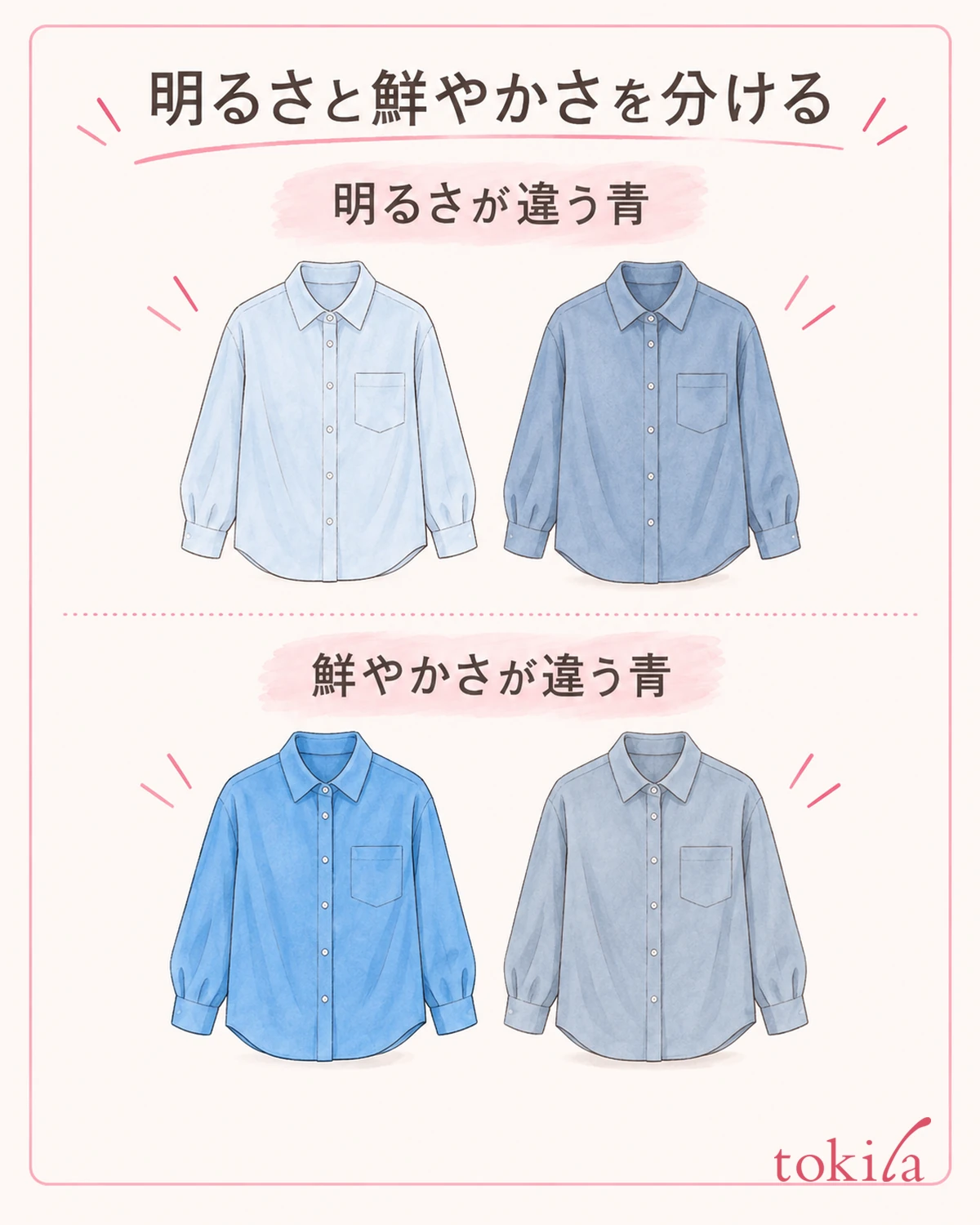
Even two pieces with similar brightness may look like a clear blue on one and a calm blue with some gray in it on the other. What you are looking at here is vividness. Don't think that brighter colors are always more vivid or that darker colors are always calmer; check the two separately.
If only one stands out strongly, decide whether you want that piece to be the star. On a day you want to wear a vivid top, you can keep that color and swap the bottom for a calmer one. On a day you want the whole look to be gentle, you can compare another piece with a similar vividness to the top. There is no rule that you must not use vivid colors.
Next, look at the direction of the undertone, such as yellowish, reddish or bluish. Even under the same name "beige," some feel yellowish and some feel pinkish. Bring the edges of the two pieces close together and see where they feel different. This is not a task of identifying exact color values or differences in dyes at home.
If you try to match brightness, vividness and undertone all at once, it becomes hard to choose among candidates. Choosing one element to match, such as "match the vividness but give a difference in brightness," makes the purpose of the comparison clear. On days you enjoy combining different undertones, the same procedure lets you check your own preference.
Don't fix the colors you can wear based on the momentary impression of holding a piece up to your face. Here you are choosing a combination of two pieces. There is no need to widen it into skin-tone diagnosis or a process tied to a particular seasonal classification.
If you like both pieces, you can also keep ways to use them other than wearing them together. Combine each one separately with a plain piece you already own to enjoy each impression. Dropping the condition that you must make a set because you bought them under the same color name lets you sort out your options without forcing yourself to add accessories.
4. Align the direction of the fabric, and look at the shine and texture
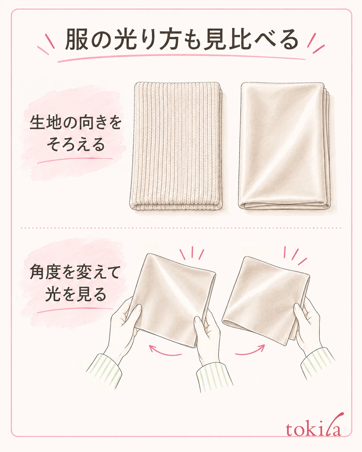
Even when the colors are close, a glossy fabric and a fabric with a pile shine differently. If only one looks whitish with shine, check the direction of the clothes and the angle you look from before looking for yet another color. A clue is not treating surface reflection and a difference in undertone as the same problem from the start.
With the two pieces still lined up in the same place, move slightly left and right yourself and look. If the bright shiny part shifts, the way the surface shines is also involved. Next, align the top-and-bottom direction of both pieces and compare them in the direction you would naturally wear them. You don't need to pull fabrics whose look changes with the nap or wrinkles to flatten them forcibly.
Don't press hard to remove the unevenness of a knit, or rub to remove the gloss of satin. Comparing is not a task of processing the clothes. There is no guarantee that changing the lighting will always make them look the same color, and you choose with in mind that the impression also changes when you move outdoors.
If you like the difference in shine, you can keep it as a variation within the same color family. Conversely, if it bothers you that only one shines strongly, line up one candidate with a similar gloss rather than choosing again by color name alone. Here too, if you change the shape or brightness of the clothes greatly at the same time, it becomes hard to trace which difference moved closer to your preference.
It is also important not to assume from the material name alone that something "always shines" or "always looks calm." Even with the same material name, the knit and the surface finish differ. Read the labeling on the clothes you own to check care conditions, and check how they look on the actual item.
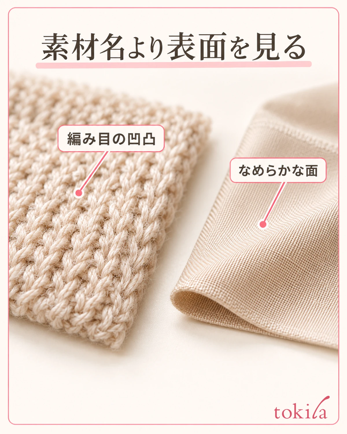
For a fabric where shiny and dark-looking parts sit close together, don't compare just one small spot; check the broad surface that shows as clothing. Prioritize whether it bothers you when you wear it over erasing slight differences in reflection. If it is hard to decide from laying them flat alone, don't rush to a conclusion here; move on to the full-body check.
5. Look at the area when worn, and adjust one piece at a time
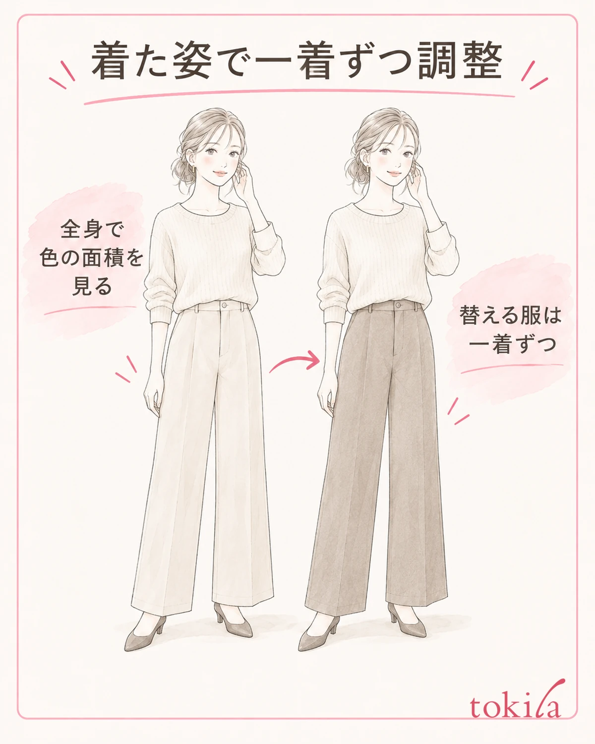
After choosing while laid flat, actually put on the top and bottom and check in a mirror that shows your whole body. Even if the areas looked similar when laid out, the amount of top and bottom that shows is different when worn. The boundary and area of the colors also change with a jacket worn open at the front or a tucked-in hem.
First, without adding accessories, look at "which color catches the eye first" and "how the boundary between top and bottom feels." Turn slightly to the side or go back to your usual posture, and check the shine that wasn't visible from the front alone. You don't need to go back and forth between directly under the light and a corner of the room and compare by memory alone.
If something feels off, change one piece to suit your goal. Review the brightness difference if you want the boundary to show, the vividness if you want to match strength, and the surface texture if the shine bothers you. Changing one thing at a time rather than everything at once makes it easier to remember which choice suited your preference today.
After that, match shoes and a bag. You can extend the same color family across the whole outfit or make one part a different color. Without setting finishing conditions such as always adding an accent color or keeping a fixed ratio, if you like the combination with the clothes alone, you can keep that set as it is.
For the next time you are unsure, jot down the clothes and your decision together, such as "a bright knit for these pants" or "a jacket with a subtler shine even in the same blue." If you keep a photo, add a note about the lighting conditions, and don't treat the color on the screen as the absolute reference. If you can check from the two pieces you already own before buying more, you can try combinations you couldn't find by color name alone.