You love both the patterned shirt and the patterned skirt, but wearing them together feels unsettled. Before cutting down to a single pattern, try separating the ground color, the fineness of the motif, and how much of each is visible when worn. Once you know what bothers you, you can set an order of comparison even with the clothes you already own.
This article shows how to rethink an outfit on days when you want to bring two patterns into the same look. There is no absolute right answer or forbidden combination for mixing patterns. It is a set of steps for deciding whether you want to keep things understated or keep the fun of the patterns, and for moving closer to the look you like.
1. Place the two patterns side by side and separate the ground color from the motif color
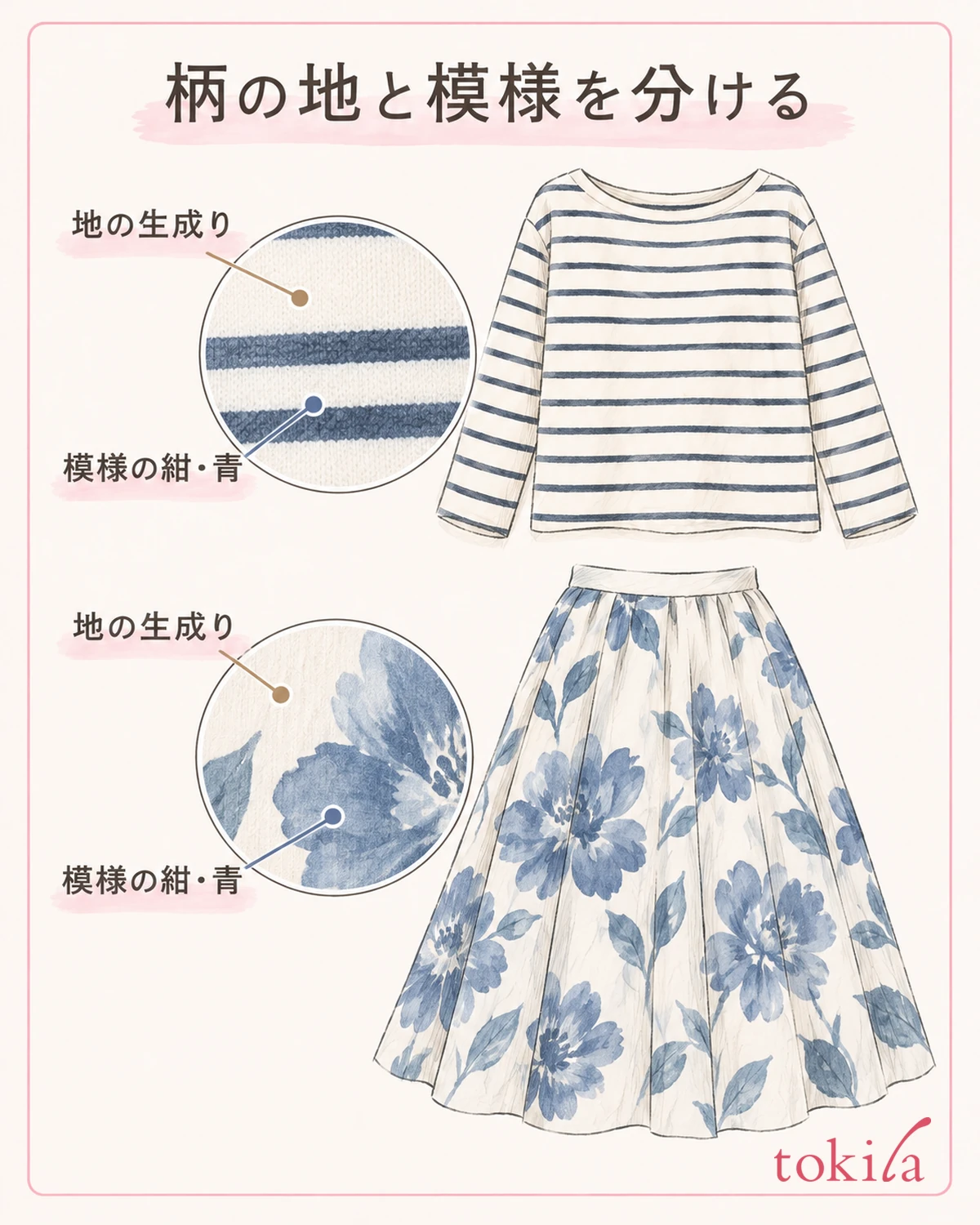
First, decide on one patterned piece you want to wear today. Next, prepare just one pattern you want to pair with it, and lay them side by side in the same light. Choose the two you would actually wear together, such as a shirt and a skirt, or a top and a scarf. Set aside candidates for bags and shoes for now, without adding more.
For a floral print, the color spreading around the flowers and leaves is the ground color; for polka dots, it is the color seen between the dots. When it is hard to separate ground and motif in checks or stripes, it is enough to divide them into the color you see broadly and the color of the thin lines. You do not need to describe every color with an exact name.
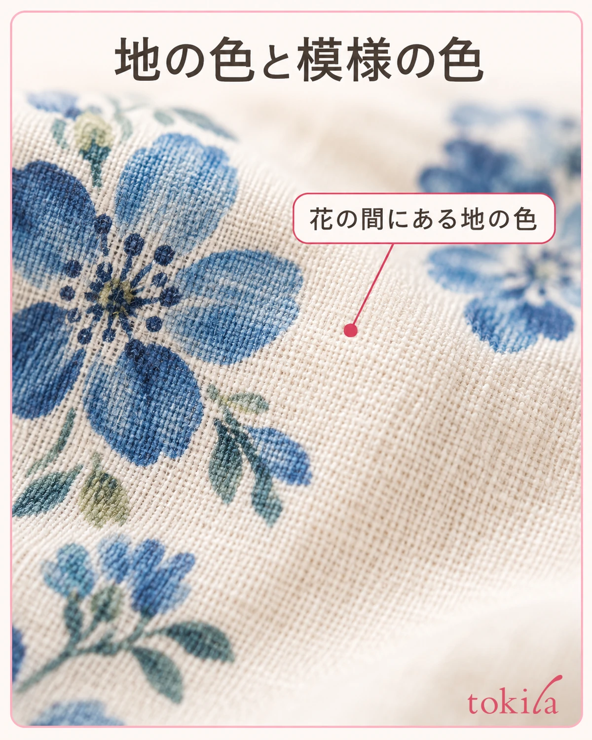
For example, set a top that is ecru with thin navy stripes next to a skirt that is ecru with blue flowers. Look for what they share: both have a light ground, and the motifs are connected by blue tones. Even if navy and blue are not exactly the same color, they can still be candidates to try.
Conversely, if the top has a light ground and the skirt has a dark ground, first observe that difference. Even if the names of the patterns are the same, the impression of the top and bottom changes when the brightness of the ground differs. Try not to decide by type alone, such as "check with check will surely work" or "floral and stripes will not go together."
After looking at the clothes up close, check in a mirror that shows you wearing them. A thin green line you can see in your hands may be almost invisible from a distance. On days when you want to feel a link between colors, use the colors that still show when you are wearing the outfit as your clue.
The method of picking solid accessories from one color in a pattern is also introduced in matching accessory colors to patterned clothes. This time both pieces have patterns, so after finding a shared color, we go on to check the fineness of the motif and how much is visible.
If you do not have both pieces at hand, there is no need to force more candidates; it is fine to stop at checking the ground and motif of the one piece you have. When you pair it with another pattern on another day and look in the same order, you can avoid deciding the colors from memory of last time alone.
2. Decide on one shared color, and compare by changing just one side
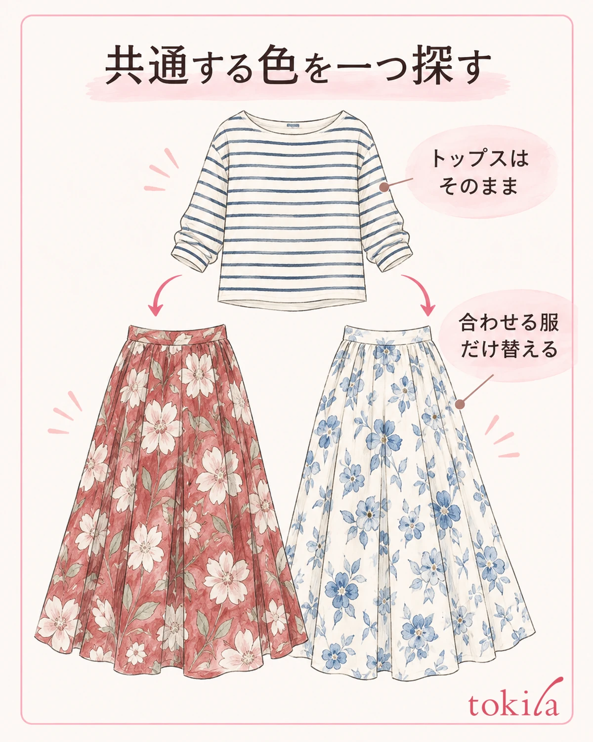
If the colors of the two patterns feel scattered, first decide on one color to share. Narrow down the axis of comparison, for example by linking the ecru ground, or by bringing the navy lines and the blue flowers closer. You do not need to make all the colors the same.
Fix the top you want to wear, and, if you have them, change only the skirt candidates. For example, keep the ecru and navy striped top and compare a floral skirt with a red ground to a floral skirt with an ecru ground. After the swap, see whether the grounds of top and bottom feel connected, or whether you find the original red ground more fun.
If the shape or length also changes with the candidate garment, do not conclude that it is the effect of color alone. It is enough to take it as "I like the whole look with this skirt." It does not mean you cannot compare unless you buy a new color of the same pattern.
If it still feels unsettled even after choosing a shared color, check how much of that color is visible. If it is a very thin line on one piece and a large expanse of ground on the other, the presence will differ even within the same blue family. Before readjusting the color names, look at which color catches the eye first.
On days when you want to enjoy two patterns, you do not need to reduce the number of colors to a set number. If you like the current combination, you can keep it as it is. Use shared colors as an option to try in situations where you want to keep things understated but the look feels scattered.
During the comparison, keep the lighting, the distance from the mirror, and how you open your jacket the same. To review the basics of color, color coordination and color schemes can also be a clue. If you wear one set first and look, then switch to the other, it becomes easier to follow which parts you liked.
3. If it still bothers you even when the colors are close, look at the fineness of the motif
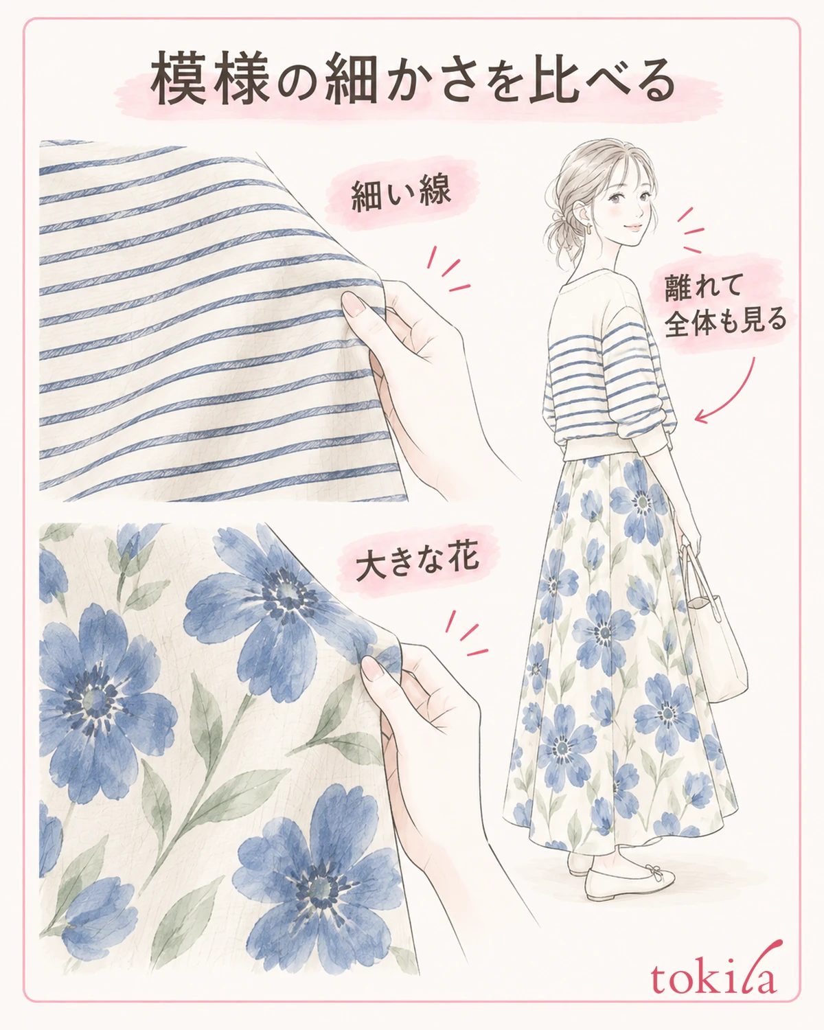
If the two patterns still feel like they compete even after linking the colors, next look at the size of a single motif and the interval at which it repeats. Patterns look different with thick versus thin lines, and with large flowers versus fine dots. This is a step of looking at the motif drawn on the fabric, not at the size of the garment.
For example, try pairing a top with thin stripes with a skirt that has large flowers sparsely scattered. Compare layering patterns of similar fineness with layering patterns where the motif sizes differ, and choose whichever makes it easier to tell which pattern you want to show off. It is not a rule that a large pattern with a small pattern will always succeed.
If you do not have another pattern on hand, swap one for a solid garment and look once. Comparing with the solid version helps you find which lines or density of the added pattern bother you. This is not a conclusion that solid is the right answer; it is a comparison to help you choose the two patterns again.
Even a fine check can look like a single gray surface from a distance. Look not only when you step close to the mirror but also from a position where you can see from your face to your feet. There is no need to count all fine patterns as patterns of the same strength.
Thin lines with clear black-and-white contrast can stand out even when small. Do not decide strength only by the size of the motif; also check the difference in brightness between the lines and the ground. Even a large pattern in pale colors can feel quieter than thin dark lines.
When you change the direction of the lines too, look at the whole outfit with the other garment swapped in. Do not turn it into a body-type rule, such as that vertical lines will always look sleek or that horizontal lines should be avoided. Check whether you can tell which pattern you like at the neckline or waist, where the patterns appear to overlap.
4. Keep the lead pattern, and adjust how much of the other is visible
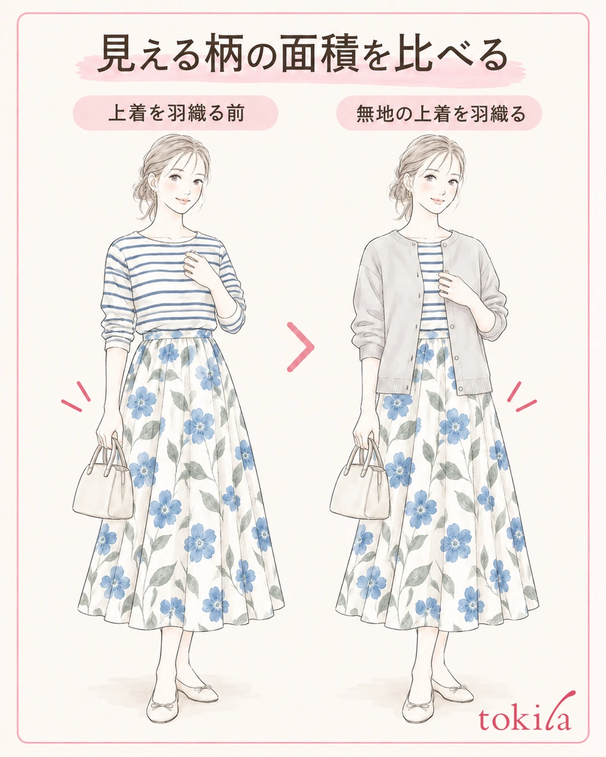
If you like both patterns but want to tone down their statement, decide which one you want to show larger. On a day when you want the skirt's floral print to be the star, one idea is to layer a solid open-front jacket over the patterned top and compare how much pattern remains at the chest.
When using a jacket, first put it on as you normally would. Without forcing the front closed or tucking and pressing the clothes in, check within the range it opens naturally. See whether the reduced visible area of the pattern makes the floral easier to enjoy, or whether you liked the original better.
If you add a scarf with a pattern, do not decide only from its spread-out state; check which part shows when tied in your usual, comfortable way. When folded, it may show only a part of a large flower, or thin lines may come to a prominent position. You do not need to tighten it at the neck to show the pattern.
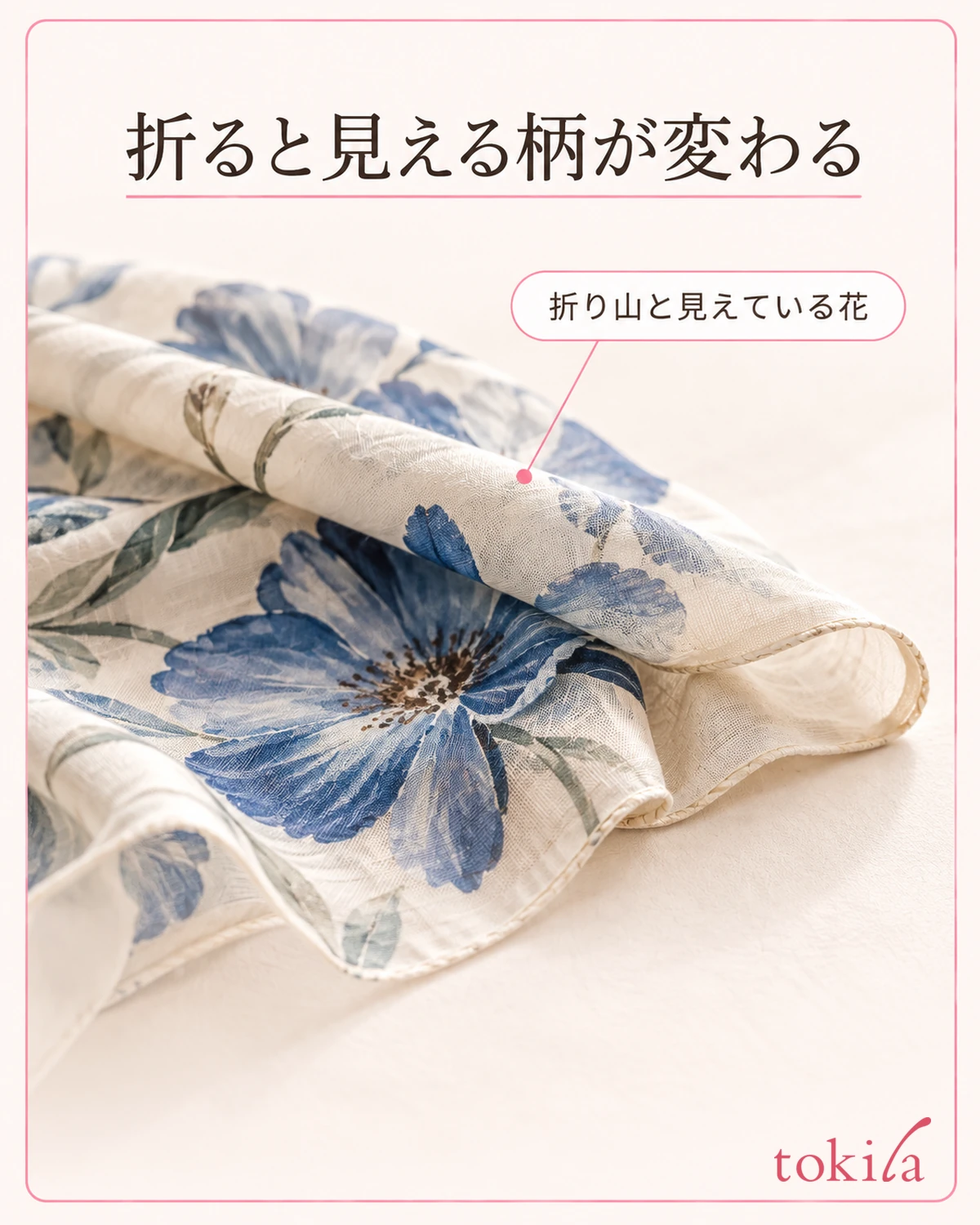
Adding a solid belt between the upper and lower patterns is also an idea, but it is an option for when you want a visual break. Because the belt's own color and width are added, adding something does not always make things calmer. Start by trying just one of the jacket or the accessory.
If you plan to take off your jacket when you are out, check the look without it too. If you choose only by how you look with the jacket on, the two patterns may show broadly indoors. Think about whether you like both looks, or whether one is enough for the day, along with where you are going.
Judge the area not by fixing a ratio but by how much is visible when you actually wear it. If making one smaller does not suit your taste, you may return to the enjoyment of showing both broadly. Do not replace the goal of making patterns the stars with only the goal of making them understated.
If layering a jacket feels hot or the sleeves are hard to move, do not adopt that way of wearing. Do not put up with discomfort just to change the area; also keep the options of a different pairing of patterns or going back to a solid garment.
5. Check in your going-out look, and if unsure, undo the last change
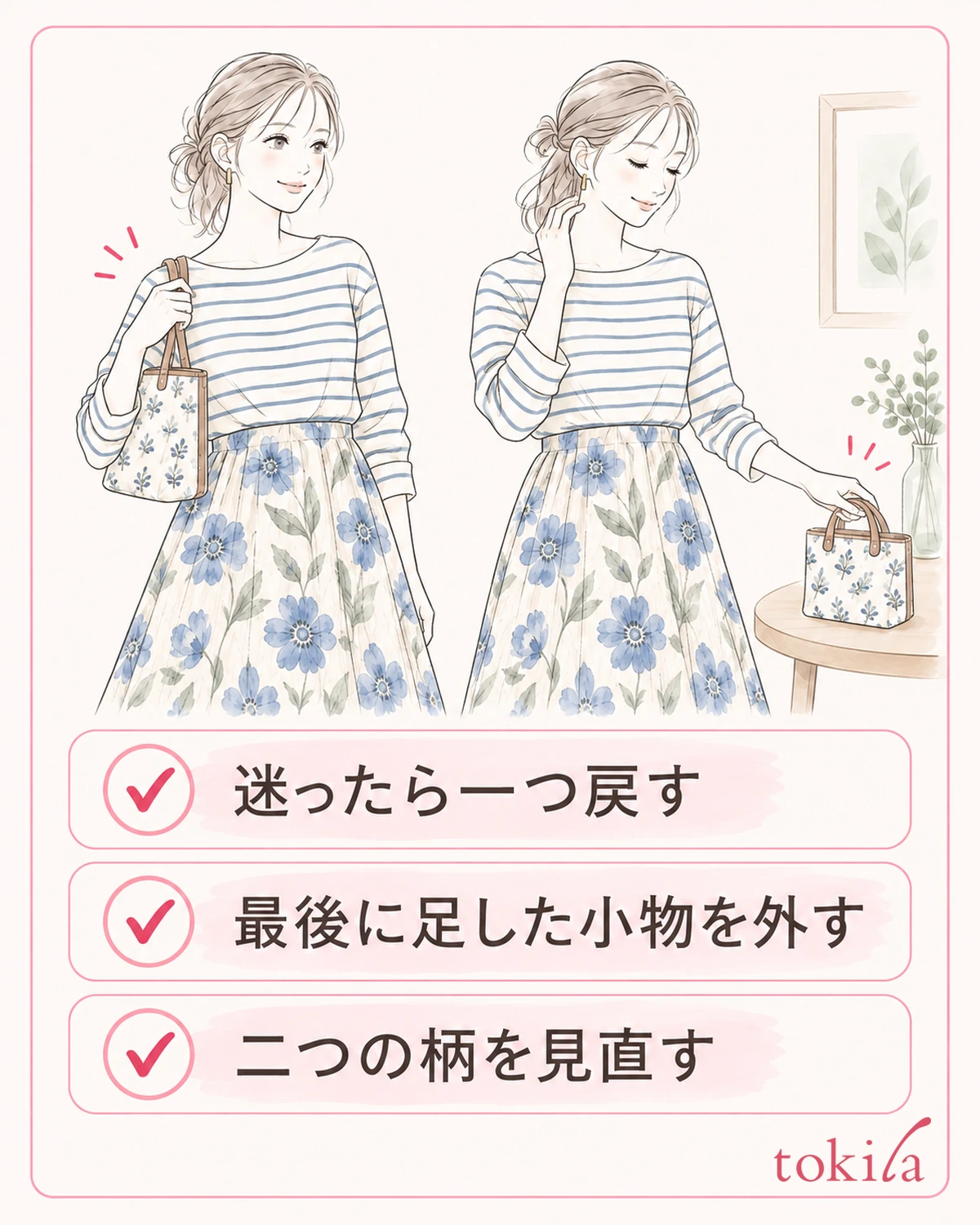
Finally, bring your going-out look, including shoes and bag, into the mirror. If you have swapped several accessories while comparing the two patterns, go back to the starting state for now. After confirming that you liked the combination of the patterned clothes, add accessories one at a time.
If you want it to feel calmer but it still bothers you, undo the most recent change, such as taking off the patterned accessory you added last or going back to whether you have the jacket on. Before trying to fix it by adding a new color, look for the stage at which you moved away from the look you liked.
Conversely, on a day when adding a shared color left it feeling lacking, one idea is to restore the original color difference. On days when you want to enjoy the patterns, you may prefer to keep the contrast. If you ask someone, adding your purpose, such as "which one do you like on a day I want to show off the floral," rather than "which is right," makes it easier to talk.
When checking in indoor and outdoor light, look at the two garments together. Avoid judging a subtle color match from photos taken on a different day. Because smartphone corrections and screen settings change how colors look, use photos only as an aid to remember combinations.
For combinations you liked, note the points you chose and how you wore them, such as "link the ecru ground," "thin lines and large flowers," or "I like the pattern even without the jacket." The next time you pair another pattern, it becomes easier to see what to fix and what to change.
Instead of making fewer patterns your goal, check whether you can enjoy the pattern you want to show today. By comparing one thing at a time, in the order of shared color, fineness of the motif, and visible area, you can find a combination you like even from the two garments you already own.